Royal Wedding Invitation Card Designs for Indian Weddings
A royal invite borrows from palace architecture: arches, domes, deep colour, and gold detail. Used with restraint, it feels grand rather than heavy.
What makes an invitation royal
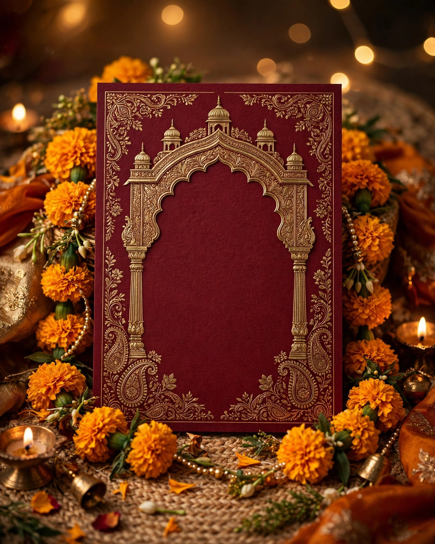
A royal invitation does not come from piling gold onto a card. It comes from palace craft: a scalloped arch, a fine line of gold, a deep colour that holds still, and one motif given room to breathe. Think of the doors of a palace, or the carved screen in a courtyard. Those shapes carry the feeling on their own.
Pick two or three rich elements and stop there. A deep burgundy ground, a gold arch frame, and a single peacock can feel more royal than ten motifs fighting for space. Keep the couple names large and clear, because grandeur that hides the names has failed at its first job.
Palace arches and carved screens
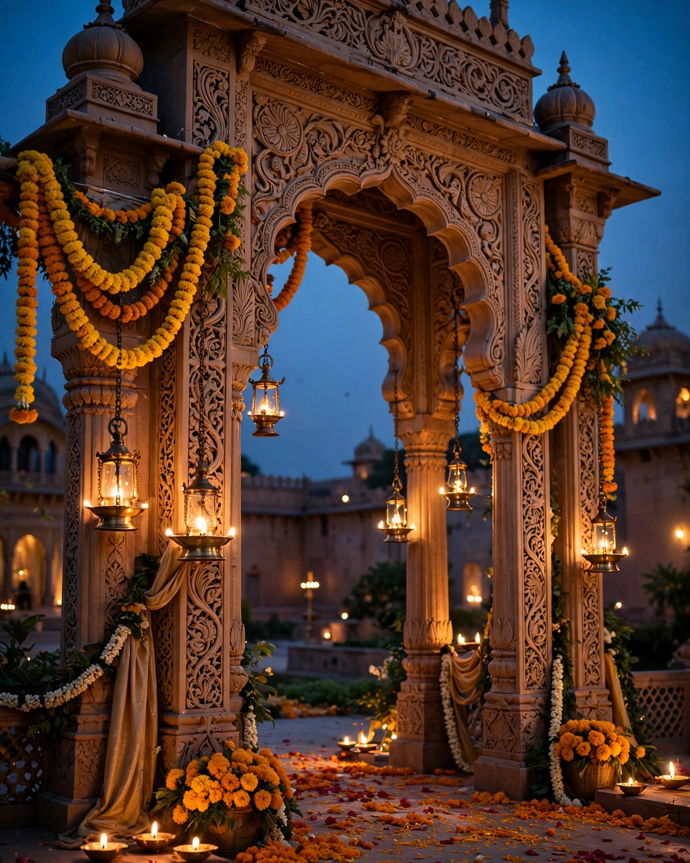
The Palace Arch
A gold scalloped arch frames the couple names on a deep burgundy ground, with a thin inner line of cream to keep the text clear. It suits a palace or heritage venue wedding, and it works best on screen, where the arch can open as the guest scrolls.
The Carved Screen
A fine lattice pattern in antique gold sits behind ivory text, like the carved stone screens in old palaces. The pattern should stay faint behind the names and grow stronger toward the edges, so reading stays easy. It suits a formal evening wedding, and it pairs well with a single lotus motif at the foot of the card.
The Courtyard Door
The invite opens on a pair of painted wooden doors in deep red and gold, which part to reveal the names inside. It suits a wedding where the venue itself has a grand entrance, and it works best as a digital invite, where the opening can move. Keep the door pattern simple, so it loads cleanly and the names appear at once.
Deep jewel colours
Burgundy and Antique Gold
Deep burgundy paper or screen, a gold paisley border, and cream names in a classic serif. This is the most familiar royal pairing, and it suits almost any formal Indian wedding, day or evening. Ask for a proof on a phone in daylight.
Emerald and Gold
Emerald green with a fine gold border and a small gold peacock feather near the names. It suits an evening wedding, especially one with green in the decor or the outfits. Keep the gold thin and even, because thick gold on green can look heavy.
Ivory and Gold
Warm ivory with a gold arch and a touch of deep red in the motif, for a royal feel that stays light and bridal. It suits a daytime wedding and a morning ceremony, and it photographs well in sunlight. Use a deep colour for the names, so they do not fade into the ivory.
Motifs that carry the royalty
The Peacock
A single peacock, drawn in fine gold lines with a touch of teal and green in the feathers, placed beside or below the names. It suits a wedding with peacock motifs in the decor, and it works on both paper and screen. Give it empty space around it, because a peacock crowded by borders loses its grace.
The Paisley Border
A paisley border in gold on a deep ground, with the centre of the card left plain for the names and dates. It suits a traditional family wedding, and it is forgiving, because paisley looks right at many sizes. Keep the paisley to the border only, and do not repeat it behind the text.
The Lotus Seal
A lotus drawn as a seal in the centre, in gold on burgundy or in deep red on ivory, with the family name beneath it. It suits a wedding where the family wants a symbol rather than a picture, and it works well as a wax seal on a paper card. Use it once, on the opening, and do not repeat it on every page.
Paper, texture, and the digital version
The Wax Seal Card
A thick paper card in burgundy or emerald, with a gold seal pressed at the fold and the names in raised type. It suits a small guest list where each card can be handled, and it feels royal because the seal asks to be broken open. Order a sample first, because seal colour varies a lot between makers.
The Cinematic Palace Opening
A short film opens on palace doors, then moves through arches and lamps to the couple names, and the events follow as scrolling pages. It suits a wedding with a strong story and a venue worth showing, and it is the best royal option for guests who will open the invite on a phone. Keep the film short, so the names appear within seconds.
The Gold Foil Invitation
Gold foil lines on a deep ground, with the names in foil and the details in cream. It suits an evening wedding and a family that wants the card to feel like an object, not a printout. Check the foil in warm light before you approve it, because foil that looks rich in daylight can glare under a tube light.
Letting one element lead

Royal design is about hierarchy. The eye should land on the names first, then the motif, then the details. If you choose a grand arch, keep the borders simple. If you choose heavy gold pattern, keep the colour ground deep and plain.
Gold needs contrast to shine. On ivory it looks soft and bridal. On deep burgundy it looks regal and dramatic. Pick the ground for the mood of your wedding. Then show the card to one elder before you send it, because royal wording carries family expectations.
Before you choose a royal design
- Pick a palette: maroon and gold, ivory and gold, or emerald
- Keep the names readable over the ornament
- Use the same motif across every function
- Preview it on a phone, not only on a laptop
Frequently asked questions
What makes a wedding invitation look royal?
Palace shapes, deep colour, fine gold line work, and one clear motif, used with restraint. A scalloped arch, a paisley border, or a peacock, given room on a deep ground, reads royal at once.
Which colours work best for a royal invitation?
Deep burgundy with antique gold is the classic pair, and emerald with gold suits an evening wedding. Ivory with gold stays light and bridal for a daytime wedding. Pick the ground for the time of day and the venue.
Can a royal invitation work on a phone?
Yes, and many royal designs work better there. An arch that opens, doors that part, or a short film of palace arches all suit a phone screen. Keep the names large, and preview the whole invite on a phone before you send it.
Should a royal invitation be printed or digital?
Either can be royal. A printed card with a wax seal or gold foil suits a small list and a formal family. A digital invite with a cinematic opening suits a large list and guests in many cities.
How do we keep a royal invitation readable?
Use one deep ground and one light colour for the names, keep gold for lines and borders rather than for small text, and leave empty space around the names. Gold text on a pale ground vanishes on a phone. Test the card in daylight and indoors before you approve it.
Related reading
See it on a real invite
Open any of these to see the full invite, then add your own names and preview it free.


Found this useful? Share it with someone planning a celebration.
Share