Best Wedding Invitation Card Designs for 2027
The invitation styles that are working in 2027, from royal and floral to modern minimal, and how to pick one that fits your wedding.
The short version
The best invitation card designs for 2027 mix a clear theme, one strong visual idea, and wording that sounds like the couple. Digital cards now lead, because guests open them on their phones within minutes. Pick a design that matches your venue and your ceremonies, not just a colour you like.
A wedding invitation card design is the complete look of your invitation: the colours, the artwork, the typeface, and the way your events are laid out. In a digital invitation, the design also includes motion, like an opening envelope or a gentle reveal of the couple's names, and sections for the venue, the schedule, and photos. A good design excites your guests, and gives them every practical detail without confusion.
The three forms to choose from
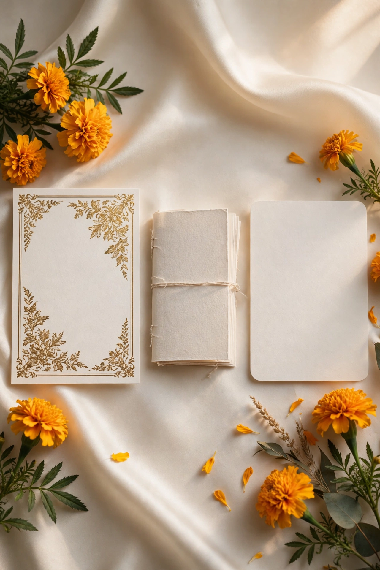
The main choice is between a cinematic invite, an invite app, and an invitation suite. A cinematic invite is a film led invitation with a rich opening sequence. An invite app is a fuller multi section invitation that guests can explore at their own pace. An invitation suite is a simpler card style invitation, ideal when you want something elegant and quick to share.
MyIndiAura has three options. A Cinematic Invite costs ₹499, an Invite App costs ₹399, and an Invitation Suite costs ₹99. Pick the form that matches how much detail and motion you want, not the most expensive one by default.
Royal and traditional
Palace gold on deep maroon
Deep maroon with gold arches, paisley borders, and the couple's names in a large serif face. It suits a palace or heritage hotel wedding, so keep the gold to the borders and the names.
Ivory and gold temple classic
Warm ivory, gold line work, a small temple motif, and generous white space around the names. It suits a temple wedding or a traditional morning ceremony, so keep the motif small and the names large.
Rajasthani bandhani
Bandhani dots in red and orange, a mirrored border, and marigold accents around the edges. It suits a Rajasthani wedding, so test the pattern behind the text, because a busy print can make the date hard to read.
Floral and romantic
Marigold and blush garden
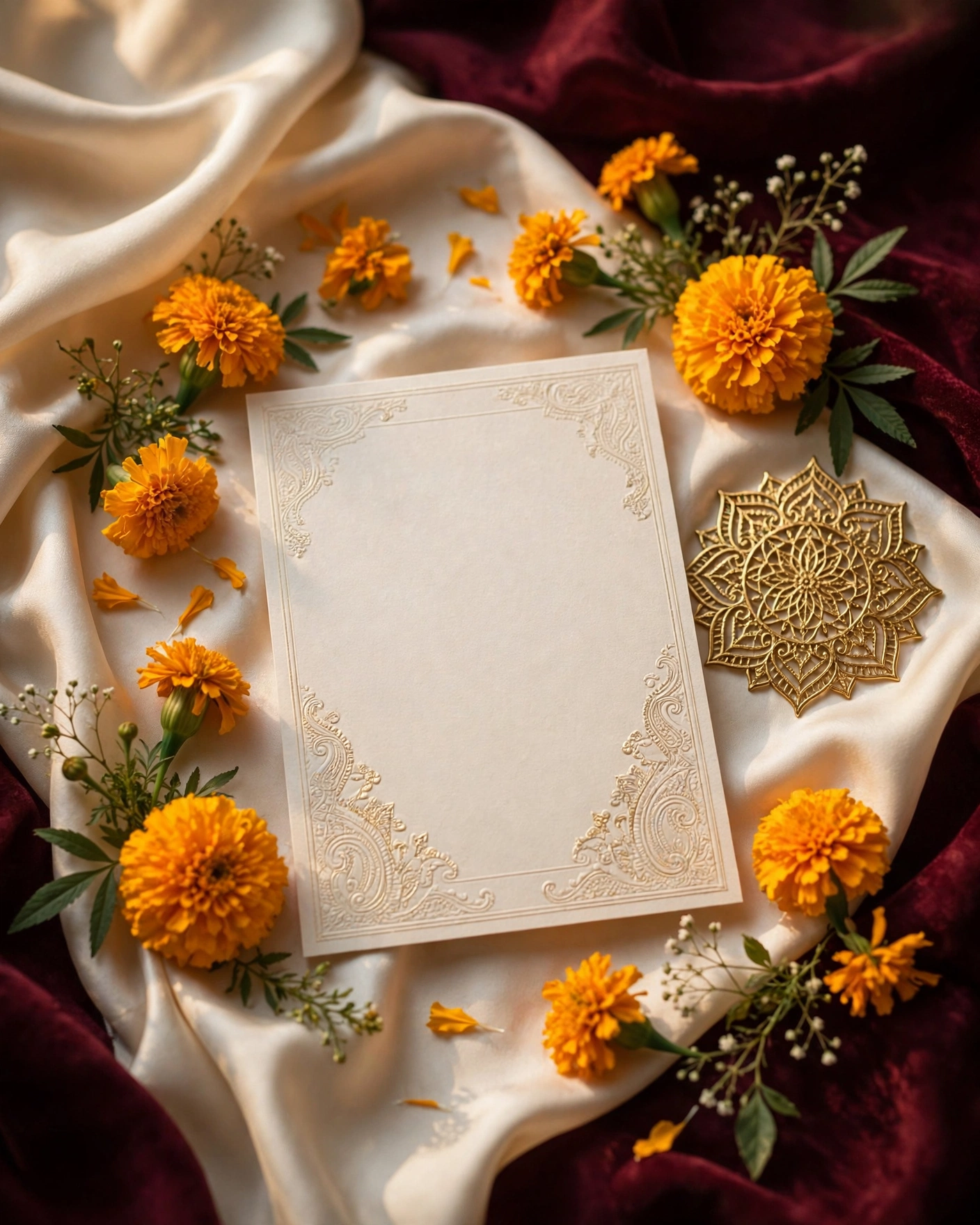
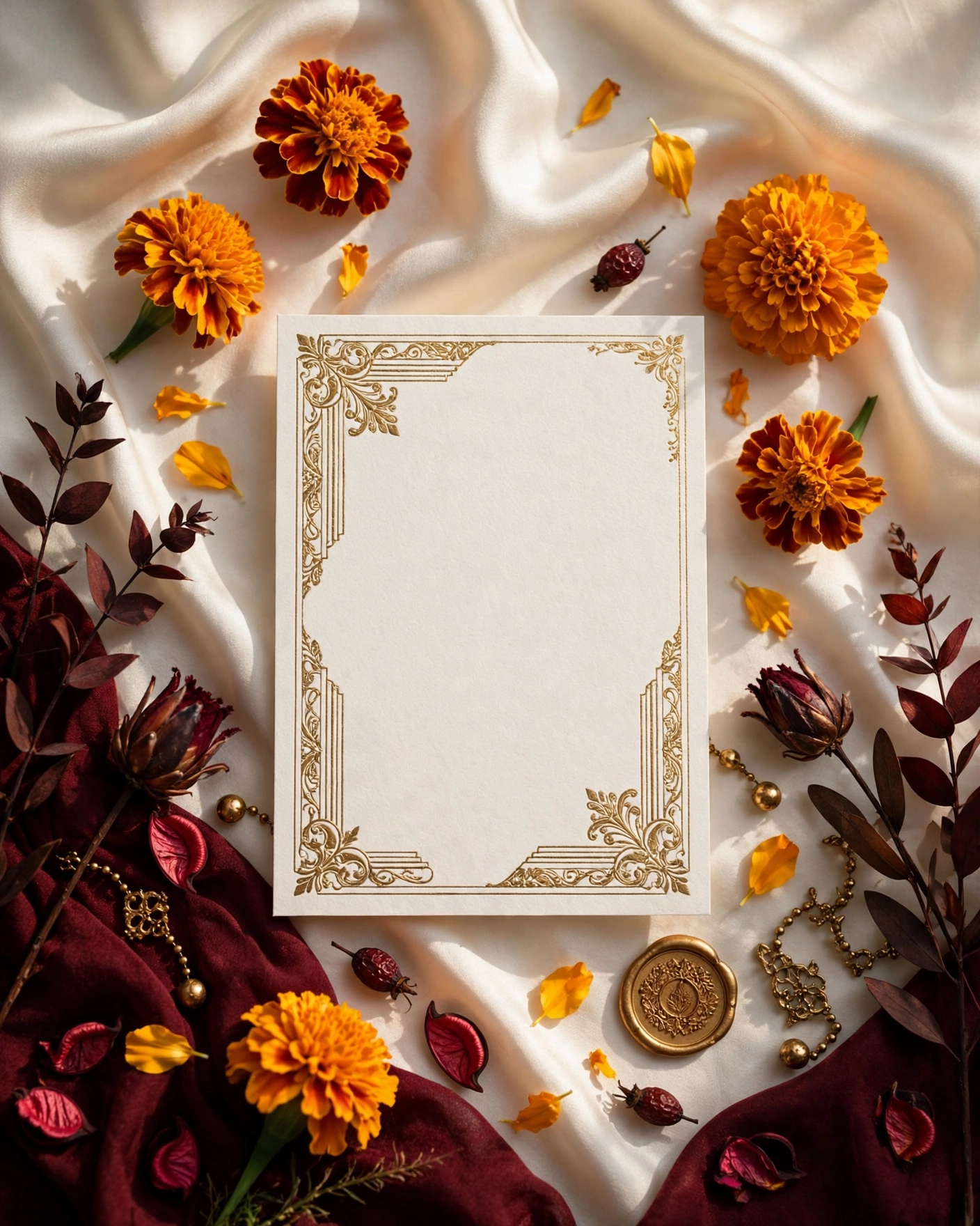
Marigold orange, blush pink, and sage green, with loose floral corners and a soft ivory centre. It suits a garden or daytime wedding, so keep the flowers in the corners and the middle clean.
Rose and champagne
Deep rose, champagne gold, and ivory, with a single rose motif repeated quietly across the card. It suits an evening reception or a hotel wedding, so use one rose, not a bouquet of different flowers.
Jasmine and white
White jasmine, pale green leaves, and a plain ivory background with fine gold lines. It suits a morning wedding or a small family ceremony, so check it in sunlight on a phone, because pale flowers can disappear.
Modern and minimal
Single line minimal
One thin gold line, the couple's names in a clean serif face, and the date in small, plain type. It suits a city wedding or a couple who dislike decoration, so make the names the biggest thing on the screen.
Botanical line art
Fine line drawings of leaves and stems in sage or charcoal, on a warm white background, with plenty of space around the text. It suits a modern couple and a daytime garden wedding, so keep the drawings to the edges.
Terracotta modern
Warm terracotta, cream, and clay brown, with a single arch shape behind the names and no other decoration. It suits a farmhouse or courtyard wedding, so keep the arch behind the names, not over them.
Playful and personal
Illustrated couple portrait
A gentle illustrated portrait of the couple, in the colours of the wedding, with the names below in a warm serif face. It suits a couple with a good illustration to work from, so keep it simple, because a detailed portrait can look muddy at phone size.
Photo led editorial
One strong photo of the couple, full screen, with the names and date in clean white type over a soft dark edge. It suits a couple with a beautiful photo they both love, so put the text over a plain part of the image, not over faces.
Wildflower meadow
Mixed wildflowers in soft colours, a handwritten style name, and a relaxed, airy layout. It suits a farmhouse or outdoor wedding, so keep the flower colours to three at most.
Matching the design to your wedding
Start with your venue and your outfits, not with a trend. A palace wedding pairs well with deep colours and gold detail. A beach or garden wedding suits lighter palettes and open, airy artwork. Then pick one signature element and let it repeat: a motif, a flower, or a colour. Too many ideas in one card makes it look busy.
Keep the couple's names the clearest thing on the opening screen, and keep the date close behind them. Guests should know who, when, and where within seconds.
Check the design on your own phone before you send it. If the names are hard to read, if the date is small, or if the motif fights the text, change it now.
What you need before you start checklist
- Couple's names, exactly as they should appear
- Wedding date, and dates of every event listed
- Venue names and addresses, with a map link
- A short line about the couple, in your own words
- Six to ten good photos you both like
- The dress code, if you have one
- RSVP details, such as a phone number or a form
- Form picked: cinematic invite, invite app, or suite
- One signature motif, flower, or colour, repeated through the card
- Phone preview checked outdoors, in sunlight, before sending
Frequently asked questions
How do we pick between a cinematic invite, an invite app, and a suite?
Pick by how much detail and motion you want. A cinematic invite leads with a film style opening, an invite app gives guests more sections to explore, and a suite is a simpler card, elegant and quick to share.
What makes a card design look good on a phone?
One strong visual idea, the couple's names as the biggest thing on the screen, and the date close behind them. High contrast text and generous size.
Should the design match the venue?
Yes, as a starting point. A palace wedding suits deep colours and gold detail, a garden wedding suits lighter palettes, and a temple wedding suits a calm, classic look.
How many photos should we use?
Six to ten good photos you both like is usually enough. Pick the strongest one for the opening screen.
Can we change the design after we send the invitation?
With a digital invitation, you can update the details and the design, and every guest sees the new version. Still, settle the names, dates, and venues before you send.
Related reading
See it on a real invite
Open any of these to see the full invite, then add your own names and preview it free.
Found this useful? Share it with someone planning a celebration.
Share