How to Choose the Perfect Wedding Invitation Theme
Choose a theme by starting with your venue and ceremonies, then mood, then colour, and previewing three finalists on your phone.
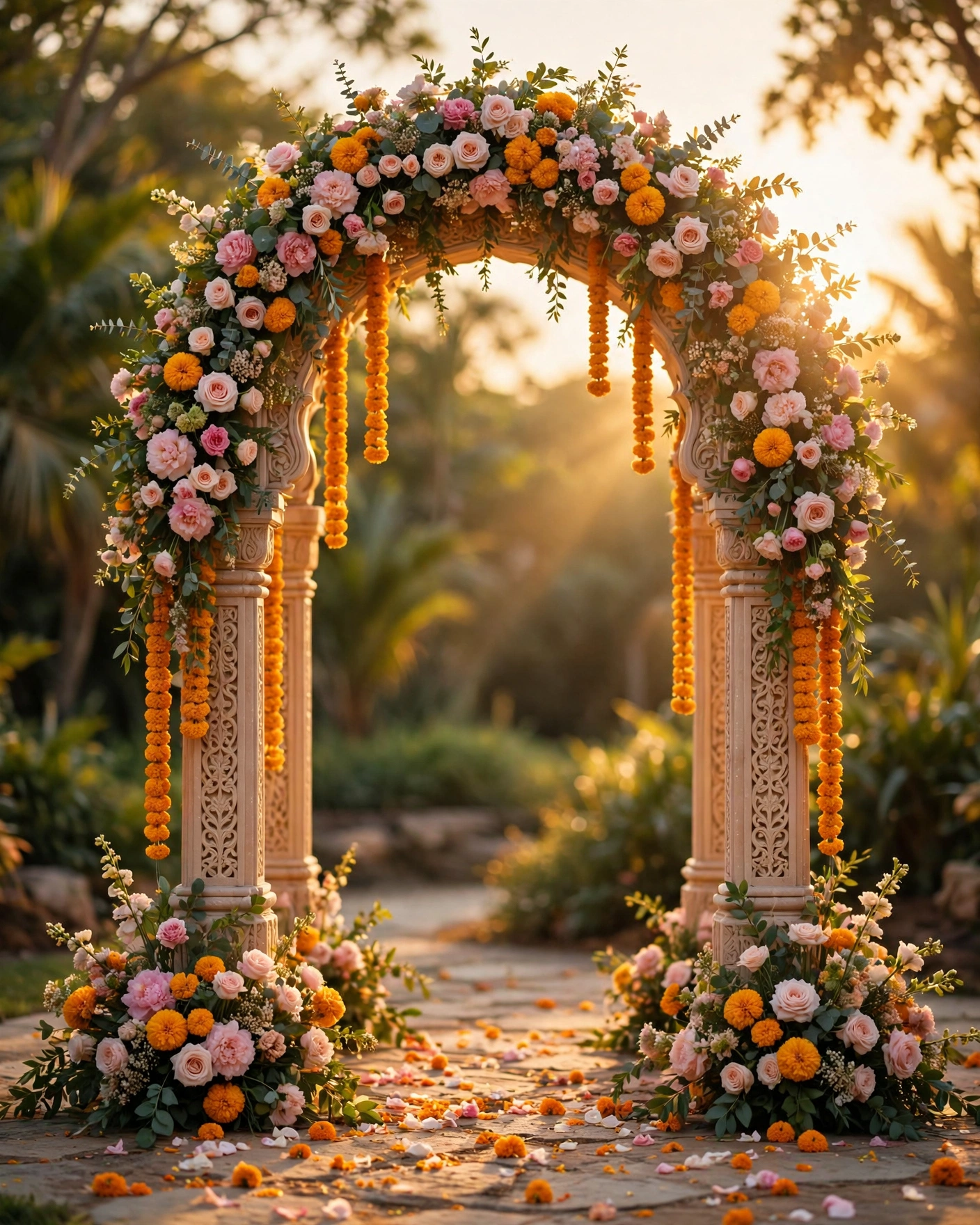
Start with the venue, then the ceremonies, then the colour
Choose a theme by starting with your venue and your ceremonies, then narrowing by mood, then by colour. Shortlist three themes, preview each on your phone with your own names and a real photo, and pick the one you both keep returning to. A theme that fits your wedding will feel obvious once you see your own details inside it.
A wedding invitation theme is the complete visual world of your invitation: its artwork, colours, motifs, typefaces, and motion. On MyIndiAura, themes range from royal and traditional to floral, modern, minimal, and playful. The theme does not change your facts. Your dates and venues stay the same. It changes how guests feel when they open the invitation. A royal theme feels grand. A floral theme feels romantic. A minimal theme feels calm and modern.
A theme carries your whole invitation: the opening reveal, the section backgrounds, the motifs beside your event details, and the mood of the photo gallery.
Five questions that choose the theme for you
- Where is the wedding? A palace, a garden, a banquet hall, and a beach each pull toward a different theme, so name the venue first.
- Which ceremonies matter most? A wedding with a big baraat and sangeet suits energy and colour, while a quiet ceremony suits calm and restraint.
- What feeling should guests carry home? Royal, romantic, playful, or calm. One word is enough, and it narrows hundreds of options to a handful.
- What are you wearing? The invitation and the wedding should feel like one celebration, so the theme should sit happily beside your outfits.
- Who is opening it? Elders read a formal theme with ease, while a young crowd enjoys a playful one. Pick the theme your oldest guest and your youngest guest can both enjoy.
Twelve directions worth shortlisting
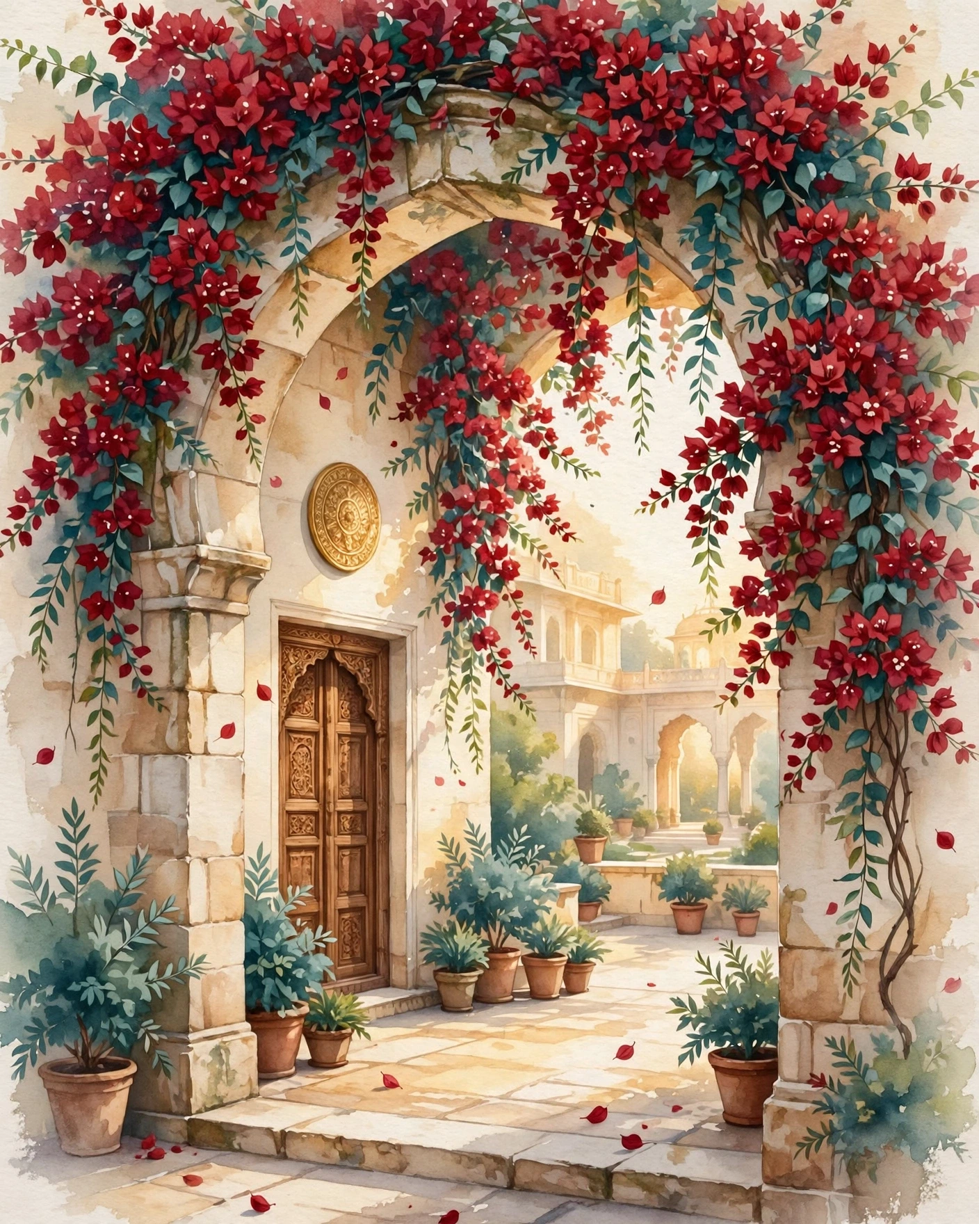
Royal palace
Deep burgundy and antique gold, carved arches, and a seal that opens like a palace door. Suits heritage venues, forts, and evening ceremonies. Tip: keep the gold to one shade, so the invitation reads rich instead of busy.
Temple gold
Warm gold, cream, and marigold with diya and lotus motifs. Suits temple weddings and traditional morning ceremonies. Tip: use the gold for borders and headings, and leave the middle of the card plain, so names stay easy to read.
Mughal garden
Ivory, blush, and sage with jaali patterns and fountain motifs. Soft, romantic, and photogenic. Suits garden venues and daytime events. Tip: ask for real flowers in the artwork rather than flat clip art, so the garden feeling survives on a phone screen.
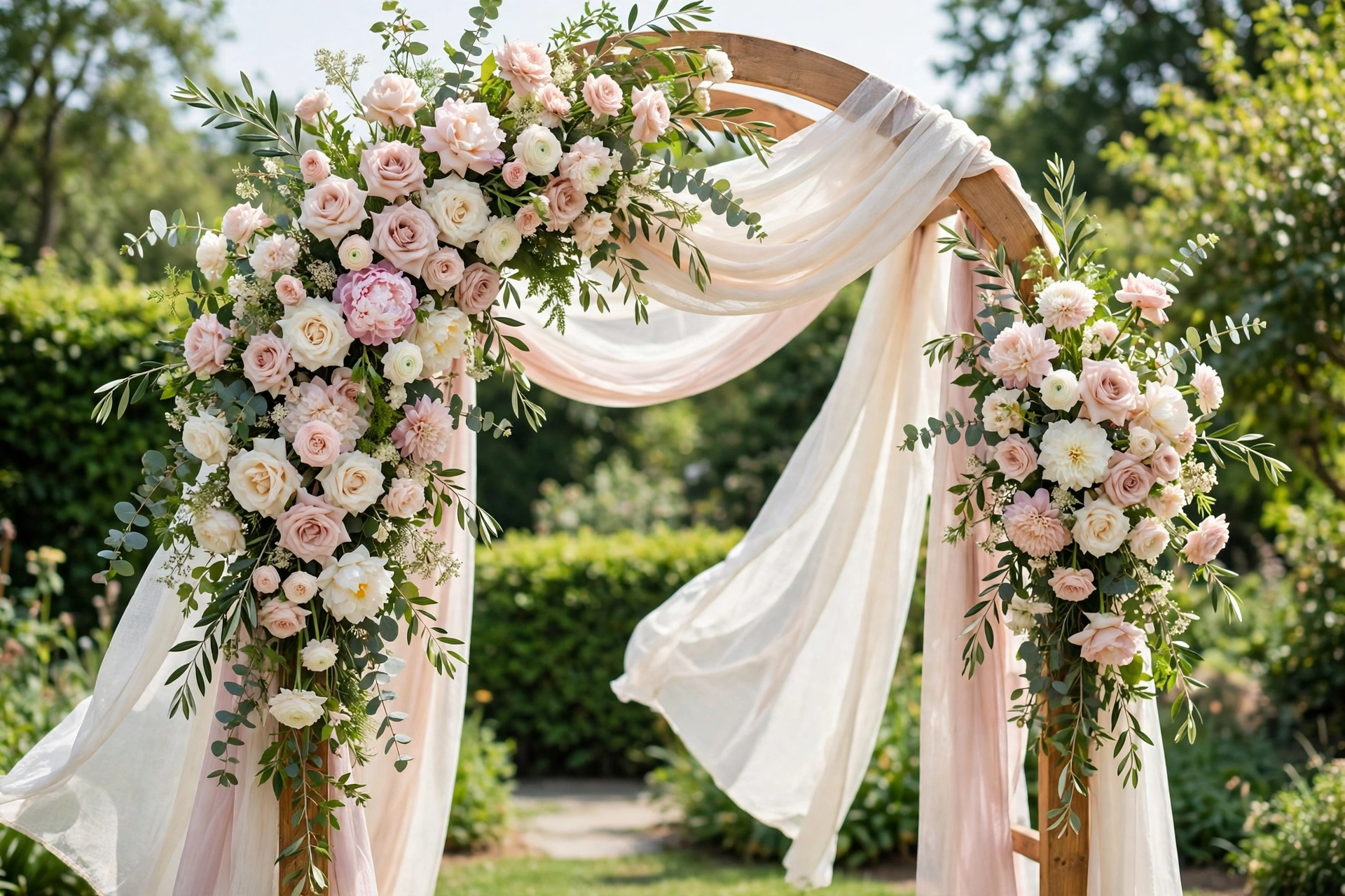
Floral romance
Blush, ivory, and rose with loose botanical artwork and flowing script. Suits garden weddings, daytime ceremonies, and couples who want softness over grandeur. Tip: one flower repeated well beats five flowers competing on one screen.
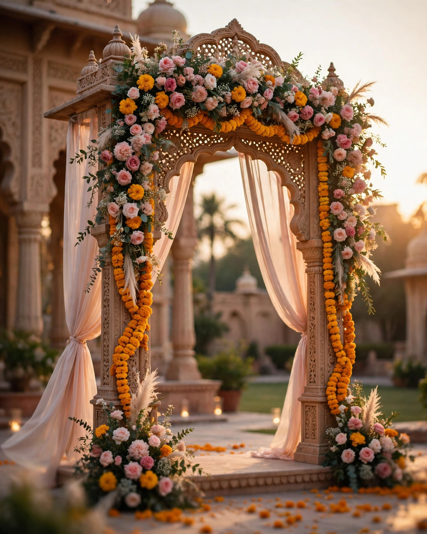
Pastel garden
Pale peach, mint, and cream with light drapes and fresh flowers. Suits spring weddings and outdoor venues. Tip: check the pastel text on a phone in sunlight, since pale colours can wash out outdoors.
Modern minimal
Ivory and charcoal with clean lines, generous space, and one small motif. Suits contemporary venues and smaller weddings. Tip: minimal only works when every remaining detail is perfect, so proofread twice and keep the photo count low.
Playful colour
Bright pink, orange, and turquoise with lively patterns and a light tone. Suits sangeet heavy weddings and joyful families. Tip: give the bright colours one quiet screen, the names screen, so guests can read the date without hunting for it.
Vintage postage
Cream paper, old stamps, postmarks, and serif type that feels like a letter from another decade. Suits couples who love paper, books, and family history. Tip: keep the postmark small and the event details large, so charm never hides information.
Watercolour wash
Soft washes of rose and gold that bleed gently into ivory, with hand painted flowers. Suits artistic couples and intimate weddings. Tip: watercolour looks best with short text, so keep each event to two lines.
Monsoon green
Deep green, brass, and cream with banana leaf and rain motifs. Suits monsoon weddings and venues with gardens. Tip: dark green needs warm lighting in photographs, so check the invite on a phone at night as well as in daylight.
Desert dusk
Sandstone, rust, and gold with fort silhouettes and evening light. Suits Jodhpur and Jaisalmer weddings and desert venues. Tip: let the fort silhouette carry the drama, and keep the text in plain cream, so it stays readable against the dusk colours.
Coastal light
White, sea blue, and sand with shells, waves, and open sky. Suits beach weddings and coastal venues. Tip: coastal themes can feel cold on screen, so add one warm accent, such as coral or gold, to keep the invitation welcoming.
The phone test
Preview each finalist with your own names and a real photo, not the demo, because a theme that looks good with demo content may feel different with yours. Open it on your own phone, on mobile data, and scroll the whole invitation as a guest would. Check the opening, the event order, the map, and the RSVP button. If any of those feel awkward in the preview, they will feel awkward for three hundred guests.
Show the shortlist to your partner and to parents, and pick the one everyone returns to. Then stop browsing.
Before you lock it in
- The venue name and a photo of the space, so colours can be matched honestly
- The dates and order of your ceremonies, so the theme fits every event
- Your five answers: venue, ceremonies, feeling, outfits, and guests
- Three finalists previewed on your phone with your own names and photo
- One person from each family who has seen the shortlist and agrees
- The theme written down, so decor and outfits can follow the same idea
Mistakes that waste a week
The first mistake is choosing by colour alone. A favourite colour is not a theme, and a colour that looks lovely on a swatch can fight your venue, your outfits, and your ceremonies all at once. The second mistake is previewing with demo names. Demo content flatters every theme, and your own names and photos are the only honest test. The third mistake is asking too many people. Ask your partner and your parents, decide, and move on.
Frequently asked questions
How many themes should we shortlist?
Three. One gives you nothing to compare, and ten blur together. Three finalists, each previewed with your own names, is enough to choose with confidence.
Should the invitation theme match the venue decor?
Yes, in feeling if not in exact colours. A palace wedding in a minimal theme feels wrong, and a beach wedding in a royal theme feels heavy. Match the mood first, and the colours will usually follow.
Can one theme cover a whole wedding week?
Yes, if it is flexible. A good theme has a grand screen for the wedding and quieter screens for haldi, mehendi, and sangeet. Preview at least two events in the theme before you commit, not just the opening screen.
What if our families like different themes?
Ask each side to name the feeling they want, not the theme they want. Families often agree on royal or romantic once they stop arguing about specific designs. If they still disagree, let the venue decide.
When should we finalise the theme?
Before the invitation is made, and before decor shopping begins. The theme is the thread that ties the venue, the clothes, the decor, and the invitation together, so deciding it early makes every later decision easier.
Related reading
- Best Wedding Invitation Card Designs for 2027
- Best Wedding Invitation Backgrounds and Colour Combinations
- How to Create a Wedding Invitation Online
Create your wedding invitation on MyIndiAura, and pick the theme your guests will recognise as yours.
See it on a real invite
Open any of these to see the full invite, then add your own names and preview it free.
Found this useful? Share it with someone planning a celebration.
Share