Best Wedding Invitation Backgrounds and Colour Combinations
Six proven colour combinations for wedding invitations, from deep burgundy and gold to blush and sage, and how to keep text readable.
The short version
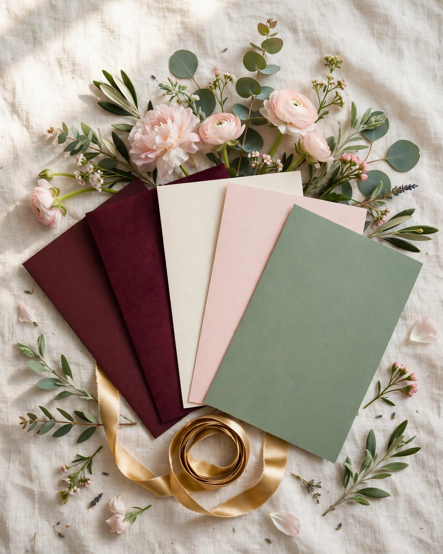
Pick the background and the palette together, not one after the other. The background is the surface your invitation is designed on, a colour, a texture, or an artwork such as a floral pattern or an arch. The palette is the set of colours that runs through the whole invitation.
Start from your venue and your outfits, not from a colour chart. Note whether events are indoors or outdoors, day or evening, and pick a mood word for your wedding: royal, romantic, modern, joyful, or calm. Shortlist two palettes, preview both on your phone, and pick the one that feels like your wedding.
Royal and deep
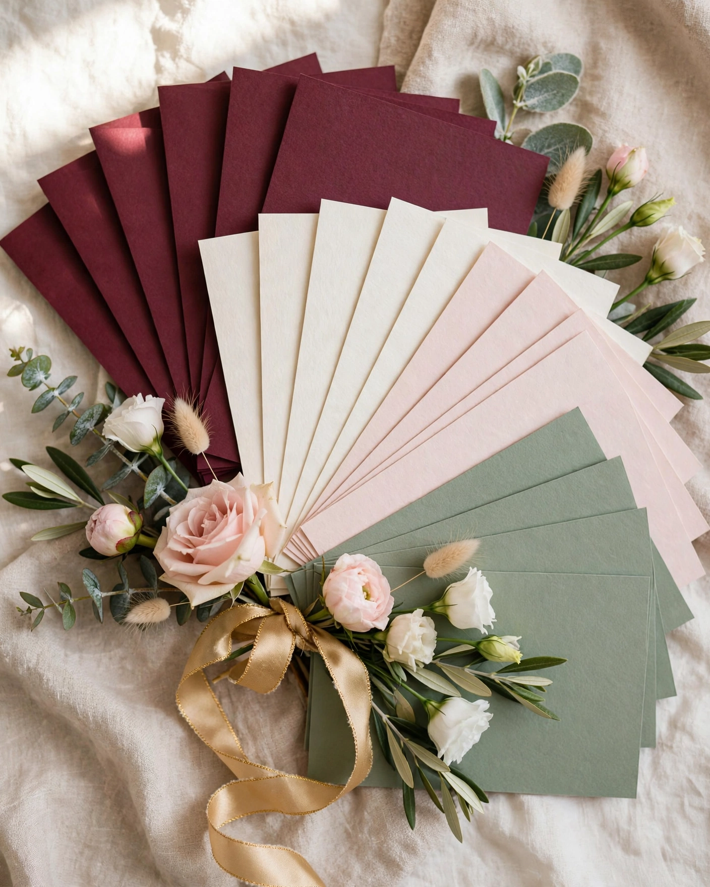
Burgundy, Ivory, and Antique Gold
A deep burgundy background with warm ivory text and antique gold lines and borders. This is the classic royal pairing, warm and formal, and it suits palace, heritage, and evening weddings. Keep the gold to lines and borders.
Emerald, Ivory, and Gold
A deep emerald background with ivory names and a fine gold border, for a rich, traditional look that feels cool rather than warm. It suits an evening wedding, especially one with green in the decor or the outfits. Keep the gold thin and even, because thick gold on green can look heavy, while a fine line looks like jewellery.
Midnight Blue, Ivory, and Silver Gold
A midnight blue background with ivory text and silver gold details, for an elegant evening palette. It suits a destination wedding or a cocktail style reception, and it stands out from the usual red and gold cards. Use warm ivory for the text, because pure white can look cold against the blue.
Romantic and soft
Blush, Ivory, and Soft Gold
A blush background with ivory text and soft gold details, for a gentle, romantic wedding. It suits garden, daytime, and floral weddings, and it pairs well with rose and jasmine motifs. Use a deep rose or burgundy for the names, because blush text on blush will vanish.
Peach, Ivory, and Rose Pink
A peach background with ivory panels for the text and rose pink flowers at the edges, for a joyful, bright wedding. It suits a mehendi, haldi, and sangeet heavy wedding week, and it feels warm and celebratory. Keep the peach pale, because a strong peach can tire the eyes across a long invite.
Lavender, Ivory, and Sage
A pale lavender background with ivory text panels and sage green leaves, for a romantic design that feels cool and quiet. It suits a spring wedding or a hill station wedding, and it is a good choice when the couple want romance without pink. Use a deep purple for the names, so they stay readable.
Calm and modern
Sage, Ivory, and Soft Gold
A sage green background with ivory text and soft gold lines, for a calm, modern wedding. It suits a contemporary venue and a minimal design, and it pairs well with a single lotus or leaf motif. Keep the sage pale, because a dark sage can look grey on some phones.
Ivory, Sage, and Soft Gold
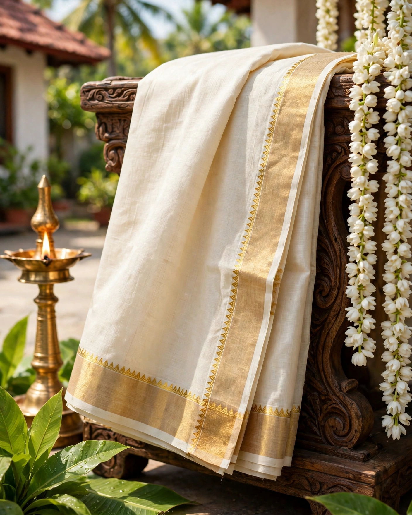
A warm ivory background with sage green details and soft gold lines, for a modern wedding that feels light and fresh. It suits a morning wedding, and it is the easiest palette to read, because dark text on ivory has the strongest contrast. Use the sage for motifs and dividers, not for small text.
Cream, Terracotta, and Gold
A warm cream background with terracotta motifs and a thin gold line, for a modern wedding with an earthy, crafted feel. It suits an outdoor or daytime wedding, and it pairs well with a simple serif for the names. Keep the terracotta to the motif, because terracotta text on cream can be hard to read at small sizes.
Bright and festive
Marigold, Cream, and Green
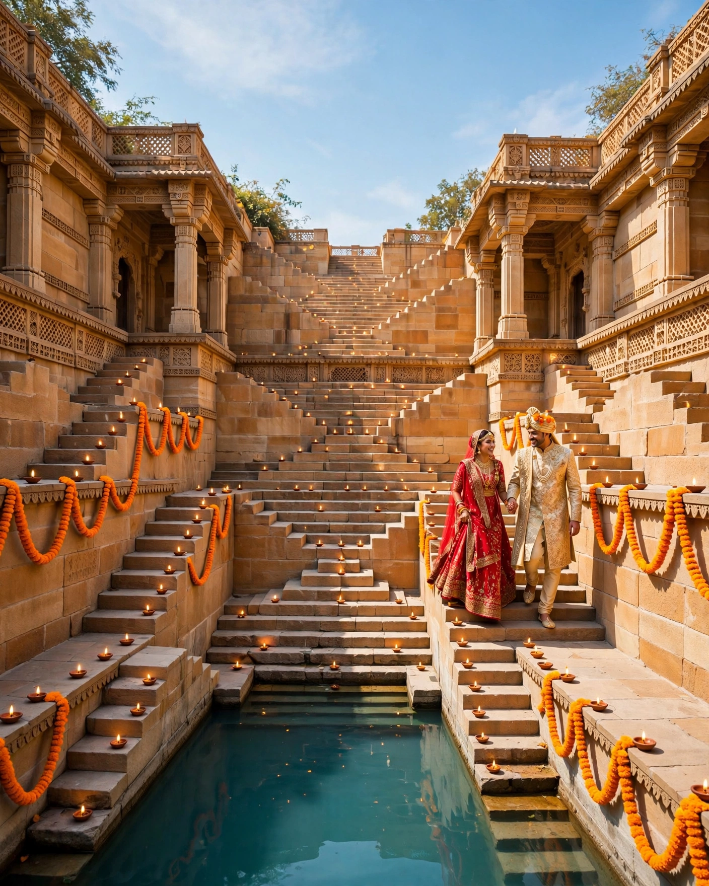
A cream background with marigold orange flowers and deep green leaves, for a festive daytime wedding. It suits a wedding where marigolds will dress the venue, and it feels joyful at once. Keep the flowers to the borders, so the cream centre stays clear for the names and dates.
Coral, Ivory, and Gold
A coral background with ivory text panels and gold details, for a bright, modern wedding that still feels warm. It suits a daytime wedding with a young crowd, and it stands out because few wedding cards use coral. Use the ivory panels for all text, because coral text on coral will not read.
Turmeric Yellow, Ivory, and Green
A soft yellow background with ivory panels and deep green details, for a haldi led wedding week. It suits a morning haldi and a festive wedding, and it feels sunny without being loud. Keep the yellow pale, because a strong yellow can glare on a phone in sunlight.
Readability first
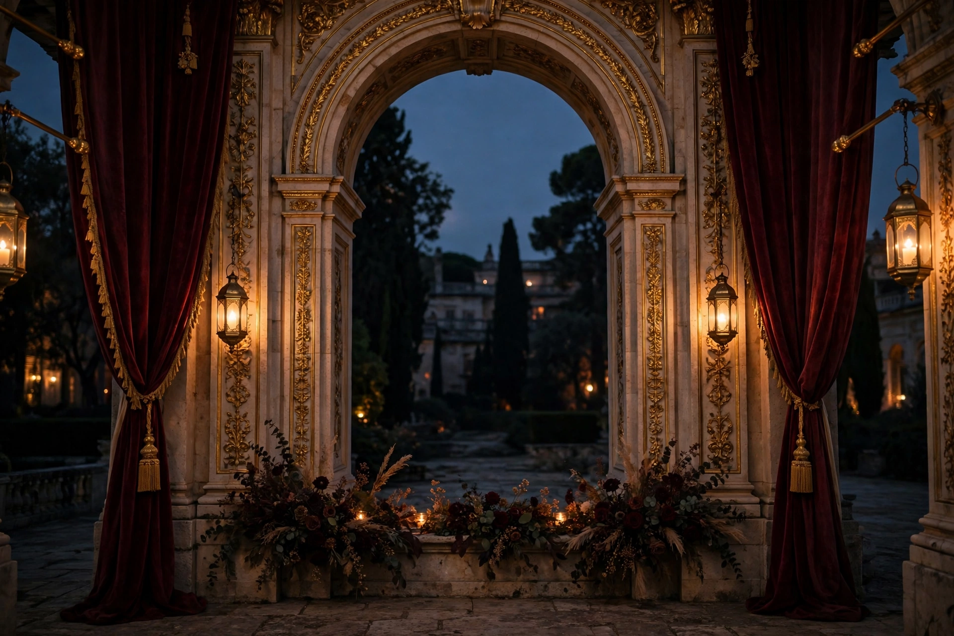
Contrast is the rule that matters most. Light text needs a dark background, and dark text needs a light background. Never place gold text on a pale background, because it vanishes on a phone screen. Test your invitation outdoors in sunlight. Keep patterns subtle behind text, and save bold artwork for borders and opening screens.
Use no more than three colours in the palette, and give each one a job. One colour is the background, one is the text, and one is the accent for lines, borders, and motifs. When a fourth colour creeps in, it usually fights the others. If you love a patterned background, put the text in a plain panel on top of it, so the pattern frames the words rather than sitting behind them. Then preview the whole invite on a phone, in daylight and indoors, and ask one person to read the names aloud. If they hesitate, the contrast is wrong.
Before you choose your colours
- Pick one main colour and one accent
- Check text contrast on the background
- Use the same palette for every function
- View the colours on two different phones
Frequently asked questions
How do I pick a background and a colour combination?
Start from your venue, your time of day, and a mood word for your wedding, such as royal, romantic, modern, joyful, or calm. Shortlist two palettes from that mood, preview both on your phone, and pick the one that feels like your wedding.
How many colours should a wedding invitation use?
Three is enough: one for the background, one for the text, and one accent for lines, borders, and motifs. Keep the brightest colour for the motif or the border, and keep the text in the clearest contrast, dark on light or light on dark.
What is the safest colour combination?
Warm ivory with a deep colour for the text and a thin gold line is the safest, because dark text on ivory has the strongest contrast. Burgundy with ivory and gold suits a royal wedding, blush with ivory and gold suits a romantic wedding, and sage with ivory and gold suits a modern wedding.
Can I use a dark background for my invitation?
Yes, and a dark background suits an evening wedding beautifully. Use light ivory text, keep it large, and keep gold for lines and borders rather than for small text.
Should the invitation palette match the wedding decor?
Yes, where you can. When the invitation and the wedding look like they belong together, guests feel the celebration before they arrive. Match the palette to your outfits and your venue decor if you can.
Related reading
See it on a real invite
Open any of these to see the full invite, then add your own names and preview it free.

Found this useful? Share it with someone planning a celebration.
Share