Luxury Wedding Invitation Designs for Modern Couples
Luxury is restraint: a limited palette, one strong motif, and generous space. How modern couples can get that feeling in a digital invitation.
What luxury means here
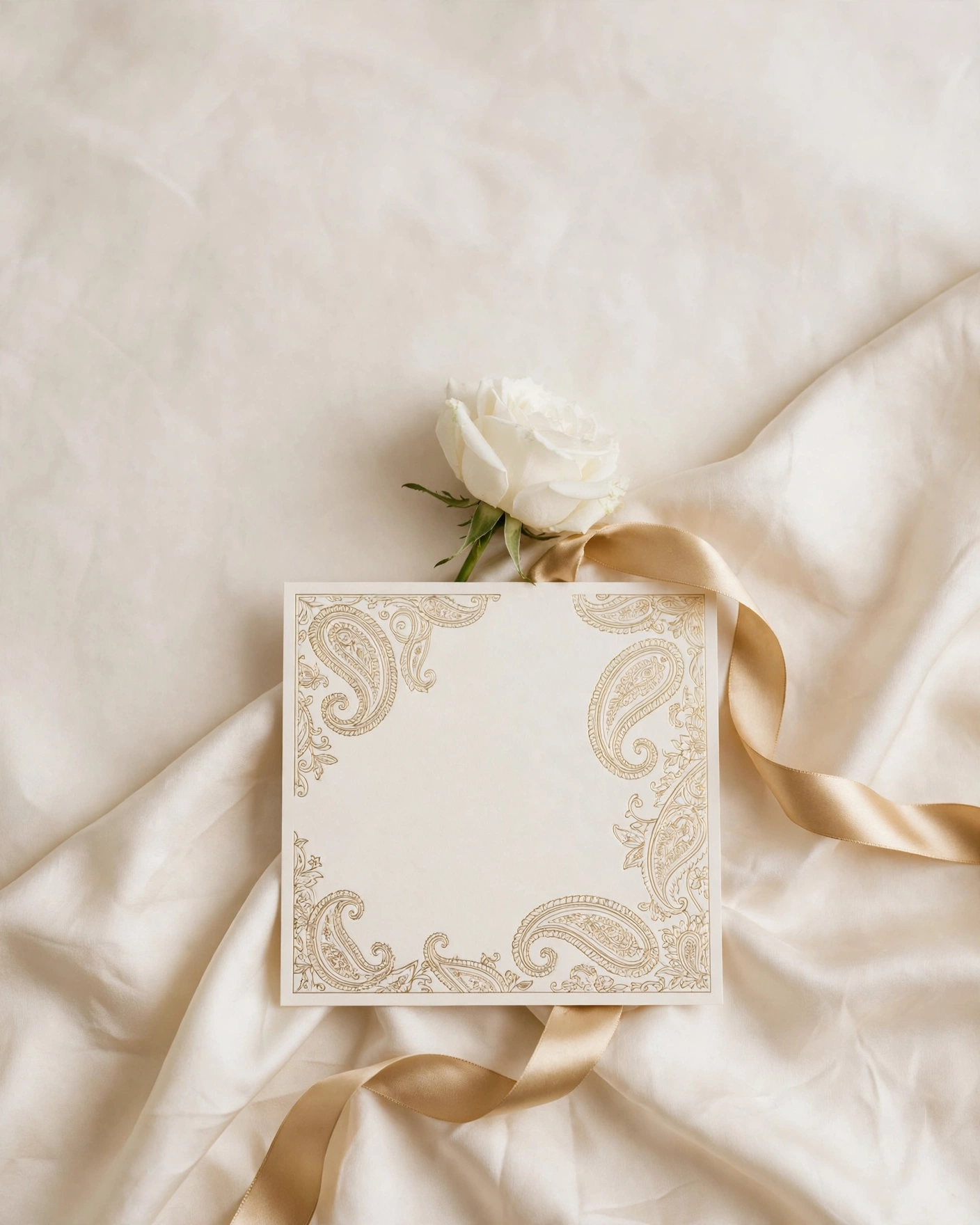
A luxury invitation feels calm, spacious, and precise. It uses a limited palette, one strong motif, and elegant type, and it lets the couple's names breathe. Digital luxury adds motion: a slow reveal, a gentle opening, and sections that arrive in order. The goal is an invitation guests linger over, not one they skim.
Luxury is not about adding more. It is about choosing well and then stopping. A narrow palette, one motif repeated with care, short confident wording, and photographs that are large and few. Nothing shouts, and nothing feels crowded. Modern luxury keeps this restraint while using digital motion that print cannot offer: a slow fade, a curtain opening, a section arriving in its own time.
Royal and heritage directions
Palace Arch in Burgundy and Gold
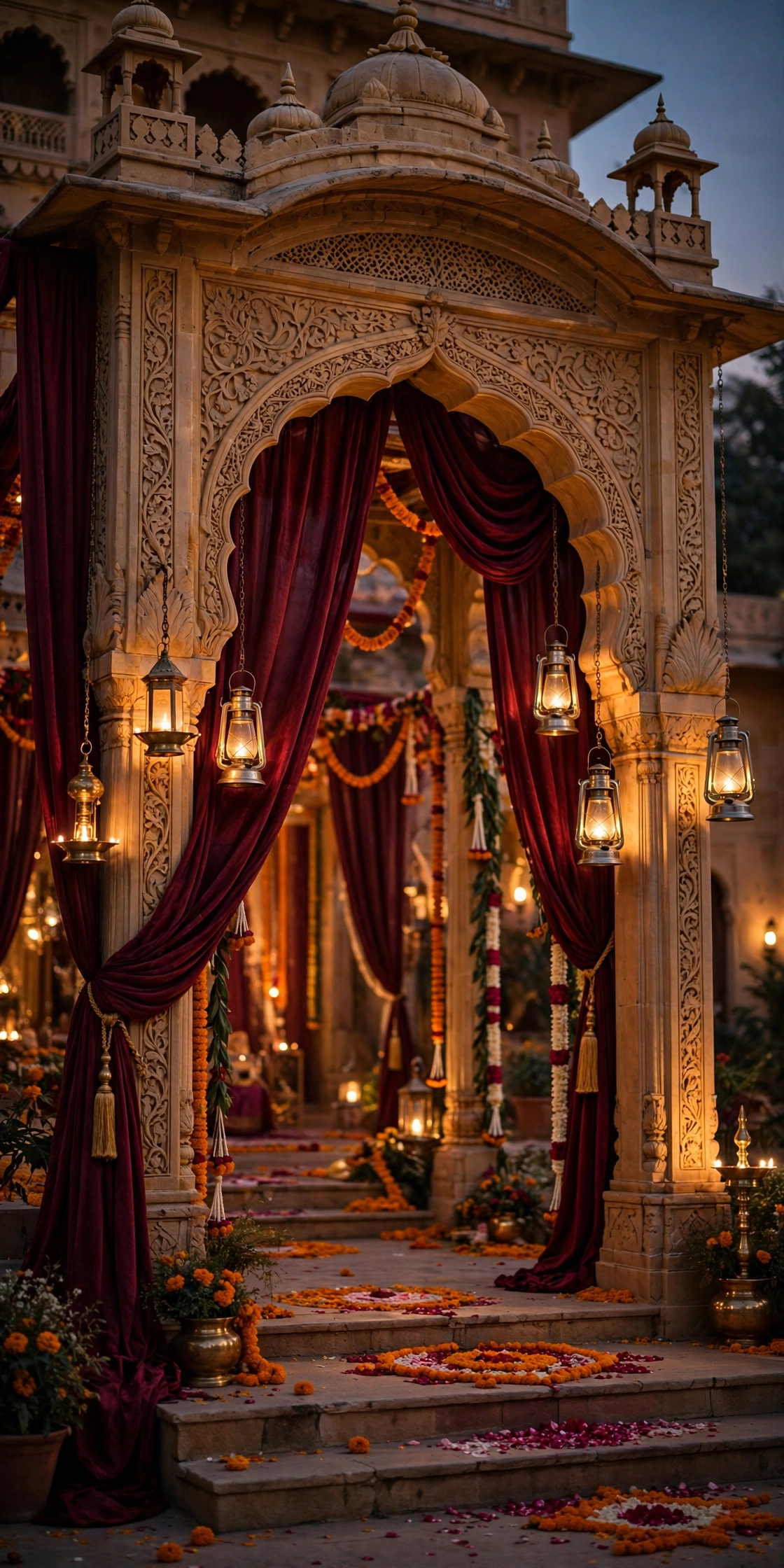
Deep burgundy with ivory and antique gold, a single palace arch framing the couple's names, and fine gold line work along the edges. The artwork is detailed but uncluttered, with the arch repeated once as a small motif on later screens.
Ivory Court with a Gold Seal
Warm ivory, soft gold, and a single circular seal motif, like a wax stamp, carrying the couple's initials. The names sit large in serif type, with generous space around them.
Mughal Jaali in Deep Green
Deep green with ivory and antique gold, a fine jaali pattern used sparingly as a border or a background panel. The pattern should be delicate, not dense, so the text stays easy to read.
Heritage Portrait in Sepia and Gold
Sepia toned photographs, large and few, set against ivory with gold rules and serif type. One portrait opens the invitation, and the rest of the sections stay quiet so the photos carry the feeling.
Modern and quiet directions
Ivory and Sage with a Single Line
Ivory and sage, lots of space, and one fine line motif running through the invitation like a thread. The names are large, the details are set in clean type, and nothing else competes for attention.
Monochrome Ivory with Sculpted Type
Ivory on ivory, with the names in large serif type and the details in a smaller, lighter weight. The luxury comes from the type itself, its size, its spacing, and the empty space around it.
Charcoal and Gold for an Evening Wedding
Deep charcoal with antique gold and ivory text, for a wedding that begins in the evening. The dark background makes the gold feel warm and the names feel lit.
Blush Editorial in Large Serif
Blush and ivory with large serif headlines and a magazine like layout, where each section feels like a page. The wording is short and confident, and the photographs are cropped generously.
Romantic and floral directions
Garden Rose in Blush and Ivory
Blush and ivory, soft botanical artwork, and a single rose motif repeated quietly through the sections. The motion is gentle, petals drifting or a slow fade, never fast or busy.
Jasmine and Gold for a Night Ceremony
Ivory and gold with white jasmine as the motif, small, delicate, and repeated with care. The design feels light and fragrant, even on a screen.
Peony in Deep Rose and Cream
Deep rose with cream and a touch of gold, peonies as the single flower, large on the opening screen and small elsewhere. The colour is rich but the layout stays calm.
Cinematic and experiential directions
The Slow Reveal Film
A film led opening with a slow reveal: a curtain, a door, or a landscape that opens onto the couple's names. The film is short, calm, and beautifully shot, then the sections arrive in order.
The Single Object Opening
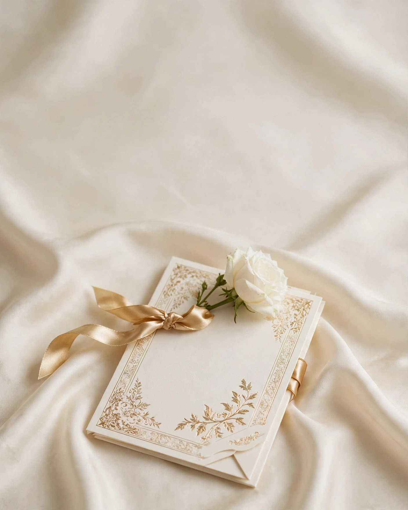
The invitation opens on one beautiful object, an envelope, a diya, a piece of jewellery, or a palace door, and the names arrive after it. The object sets the mood before any wording appears.
The Layered Arch Journey
Each section of the invitation sits inside a receding arch, so guests feel they are walking deeper into the wedding. The arches are drawn in fine gold on ivory or burgundy, and the effect is quiet and architectural.
The Calligraphy Led Invite
Hand lettered names in elegant calligraphy, with the rest of the invitation set in plain, quiet type. The calligraphy is the luxury, so it must be genuinely well done.
The subtraction test
Luxury is mostly subtraction. Remove one element from your first draft, then look again. If the invitation still feels complete, that element was not needed. If it feels empty, put it back and remove something else. Repeat until every element left earns its place.
Keep the palette to three colours at most. Use one typeface for names and one for details, and keep them consistent throughout. Let photographs be large and few, rather than small and many. Be careful with gold: a little reads as luxury, a lot reads as noise. The same rule applies to animation. One slow motion is enough. Two motions competing for attention will make even a beautiful design feel busy.
Ask yourself three questions before you call the design finished. Does the opening screen make the names the clearest thing on it. Does every section have room to breathe. Would removing one more element make it better or worse. If the answer to the last question is better, remove it.
Share the invitation quietly, as luxury is personal. Share first with parents and close family, and confirm names and dates. Share with the wider family next, with a short warm note. Share with friends individually or in small groups, and avoid mass forwarding without a personal line. Send one elegant reminder before the wedding, with the venue and timing written out plainly.
Before you order a luxury invite
- Choose one luxury material, not several
- Ask for a printed or digital proof first
- Check the text is readable on a phone screen
- Match the invite to your wedding decor palette
Frequently asked questions
What makes an invitation feel luxurious rather than just expensive?
Restraint. A narrow palette, one motif, generous space, and wording that is short and confident.
Should a luxury invitation be printed or digital?
It can be either, and many couples use both. A printed card is a keepsake, while a digital invite adds motion, music, and a map.
How many photos should a luxury invitation have?
Five to eight exceptional photos, not twenty average ones. Choose photos where you both look relaxed and happy, and let each one be large enough to enjoy.
Is gold always part of a luxury design?
No. Gold is common, but it is not required.
How do we know when to stop adding details?
Use the subtraction test. Remove one element and look again.
Related reading
See it on a real invite
Open any of these to see the full invite, then add your own names and preview it free.

Found this useful? Share it with someone planning a celebration.
Share