Minimalist Wedding Invitation Designs That Look Elegant
Minimalist does not mean empty. It means one clear focal point, generous space, and nothing that distracts from the couple's names and the wedding date.
What minimal really means
Pick one focal point, usually the couple's names, and let everything else stay quiet. Keep every detail, but set it in a clear order, so nothing important gets lost.
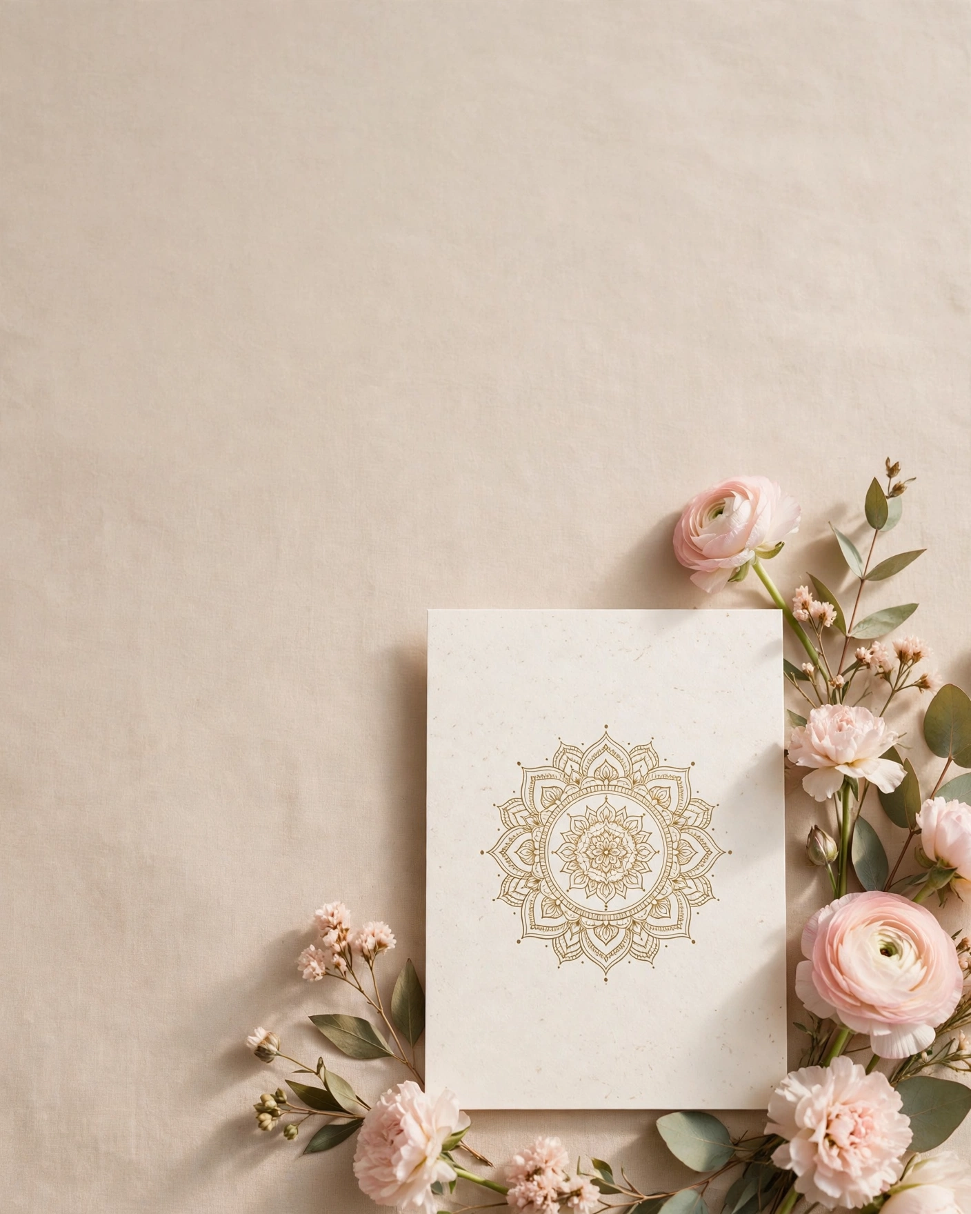
A minimalist wedding invitation strips away decoration until only the meaningful parts remain. The names, the date, the venue, and one beautiful motif carry the whole design.
Minimalist design suits couples who want a modern wedding without losing warmth. It works beautifully for small weddings, city weddings, and couples who prefer clean lines over heavy ornament.
Quiet and classic directions
The Single Card
One card, front and back, with names, date, and venue, and nothing else on the front. The names sit large in serif type, the date sits below them, and the venue sits below that.
Ivory and Gold with One Fine Line
Ivory with a single fine gold line as the only decoration, running across the card or framing the names. The line should be thin, straight, and consistent.
The Names Only Opening
A digital invite that opens on the couple's names alone, large and centred, with nothing else on the screen. Guests tap once, and the details appear in order.
Serif and Space
Large serif headlines, clean sans body text, and generous space between every element. No border, no motif, no pattern, just type and air.
Nature and colour directions
Sage and Ivory with One Sprig
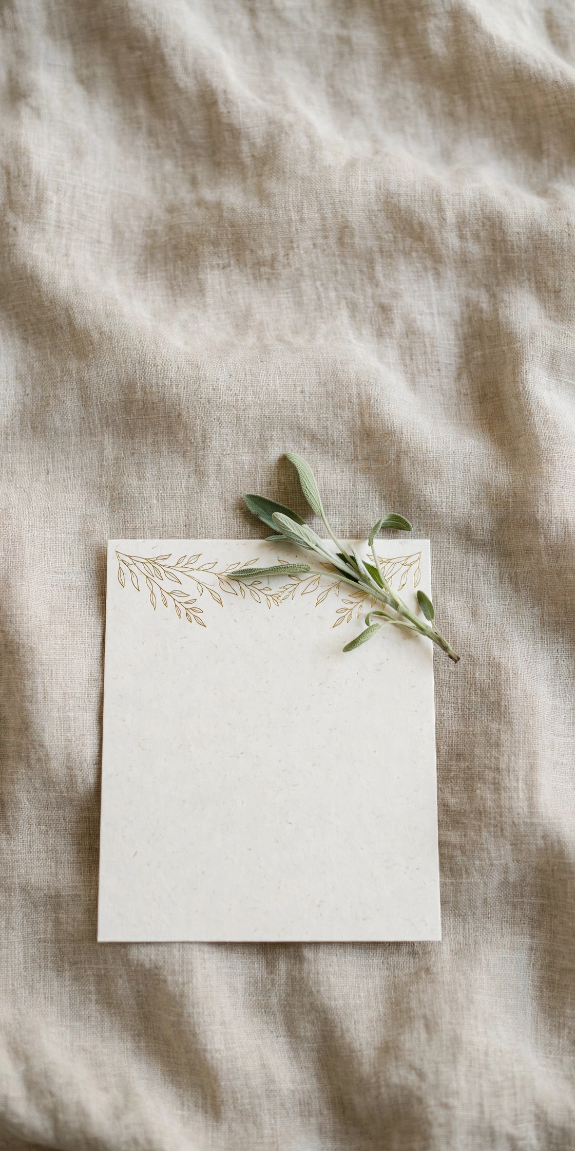
Sage and ivory, with one botanical sprig as the only decoration. A single eucalyptus or olive sprig, drawn finely, sits beside the names or at the foot of the card.
The Single Rose
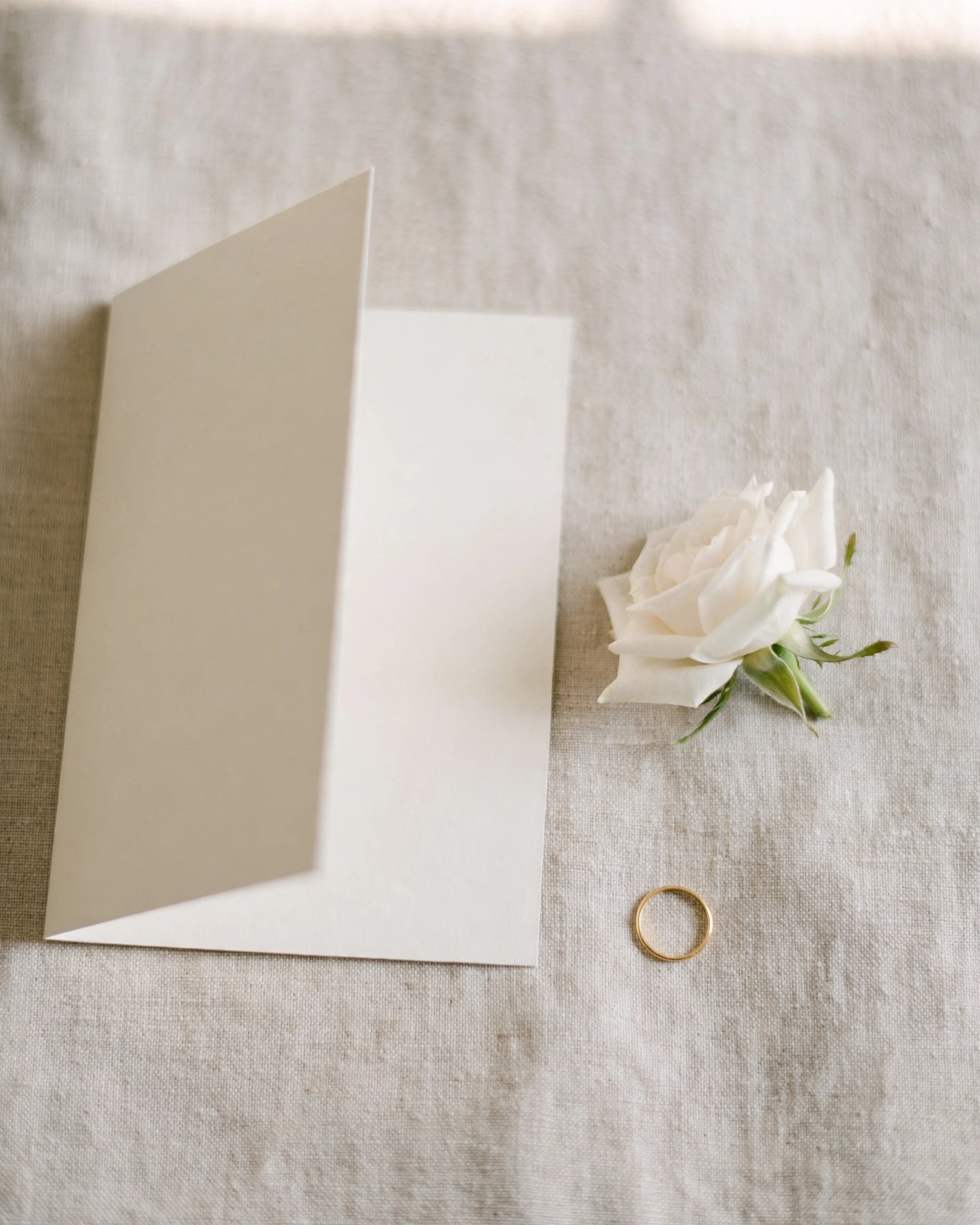
One white rose, photographed or drawn simply, with the names beside it and nothing else. The rose carries all the romance, so it must be beautiful on its own.
Blush Wash with Plain Type
A soft blush wash across the top or bottom of the card, with plain, dark type over it. The colour is the decoration, and it needs no motif to support it.
Stone and Sand
Warm sand and stone tones, with no bright colour at all, and a single small motif such as a thin arch or a small sun. The palette feels calm and grounded.
Modern and graphic directions
The Thin Arch
One thin arch, drawn in gold or charcoal, framing the names. The arch is the only graphic, and it should be fine and precise.
Monochrome in Charcoal and Ivory
Charcoal text on ivory, with no colour at all, and one small detail such as a thin rule or a small dot. The luxury comes from the contrast and the spacing.
The Quiet Film Opening
A cinematic invite that opens on a quiet scene, a still landscape, a single flower, or an empty courtyard, and reveals the events one at a time. The film is slow, with no fast cuts and no loud music.
The Grid Layout
A clean grid, with each detail in its own place, names at the top, date below, venue below that, and events in a simple list. No decoration, just order.
Personal and warm directions
The One Photo Invite
Two or three favourite photos, large and few, with the names and date in plain type. One photo opens the invitation, and the rest appear later, each given room to breathe.
The Handwritten Line
One handwritten line, perhaps your names or a short welcome, set against plain type for the rest. The handwriting adds warmth and personality, while the plain type keeps the details clear.
The Single Motif, Repeated Once
One small motif, a paisley, a flower, or a diya, used twice: once large on the opening, once small at the close. The repetition ties the invitation together without filling it.
Choosing your one accent
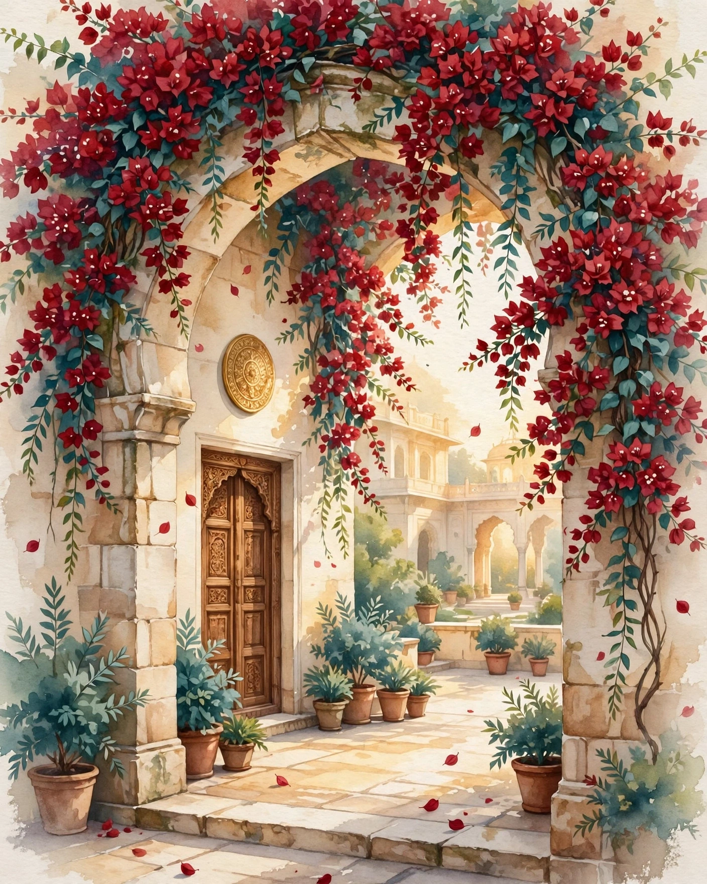
Choose your one accent with care, because in a minimalist design it carries all the feeling. Deep burgundy feels traditional and rich, sage feels fresh and calm, and antique gold feels celebratory without being loud. Use it sparingly: a thin rule, a small motif, a single word in colour.
Type matters more than decoration here. Pair a serif headline with a clean sans body, keep sizes generous, and never crowd the names. If a line feels tight, remove something rather than shrinking the text.
Test your accent on a phone screen before you commit. A colour that looks rich on a laptop can look dull on a phone, and a thin gold line can disappear on a bright screen.
Before you start checklist
- Your names, exactly as they should appear on the invite
- The wedding date, time, and venue, confirmed and final
- One colour accent and one motif, chosen together
- A short event list, if you have more than one ceremony
- Two or three favourite photos, not a full album
- A final proofread, since minimal layouts show every typo
- A phone check in daylight, to confirm the accent and text are clear
- One family member to read it fresh before you send
Common mistakes to avoid
The most common mistake is removing too much. The names, the date, the venue, and the event list must all be there, clear and easy to find.
Another mistake is using an accent that is too pale. A thin gold line can disappear on a phone screen, leaving the invitation looking blank rather than minimal. Make the accent visible, even if it is small.
A third mistake is crowding the names to fit more in. If a line feels tight, remove something rather than shrinking the text. Minimal layouts show every typo, so proofread twice.
Finally, do not add decoration at the last minute because the design feels too plain. Show it to someone who has not seen it before, and ask if it feels calm or empty.
Frequently asked questions
Will a minimalist invitation feel too plain to older guests?
Not if the details are clear and the one accent is chosen well. Older guests care most about reading the names, the date and the venue easily.
How do we choose between burgundy, sage, gold, and blush?
Think about your venue and your wedding feeling. Burgundy suits a traditional or evening wedding, sage suits a garden or daytime wedding, gold suits a formal celebration, and blush suits a soft, romantic day.
Can a minimalist invitation work for a multi day wedding?
Yes, if the layout stays ordered. Use a clean list for the events, with each event on its own line, in order, with its date and time.
How many photos should a minimalist invitation have?
Two or three favourite photos, not a full album. Let each photo be large enough to enjoy, and give it room on the screen.
What if we love minimal but our families want something grander?
Use minimal for the digital invite, where clarity matters most, and add a slightly richer printed card for elders and close family if they value it. Keep the colours and wording the same in both, so they feel like one wedding.
Related reading
See it on a real invite
Open any of these to see the full invite, then add your own names and preview it free.

Found this useful? Share it with someone planning a celebration.
Share