How to Coordinate Wedding Invitations with Wedding Decor
When the invitation and the decor tell the same story, guests feel the celebration before they arrive. One palette, one motif, one mood.
One celebration, not two beautiful things
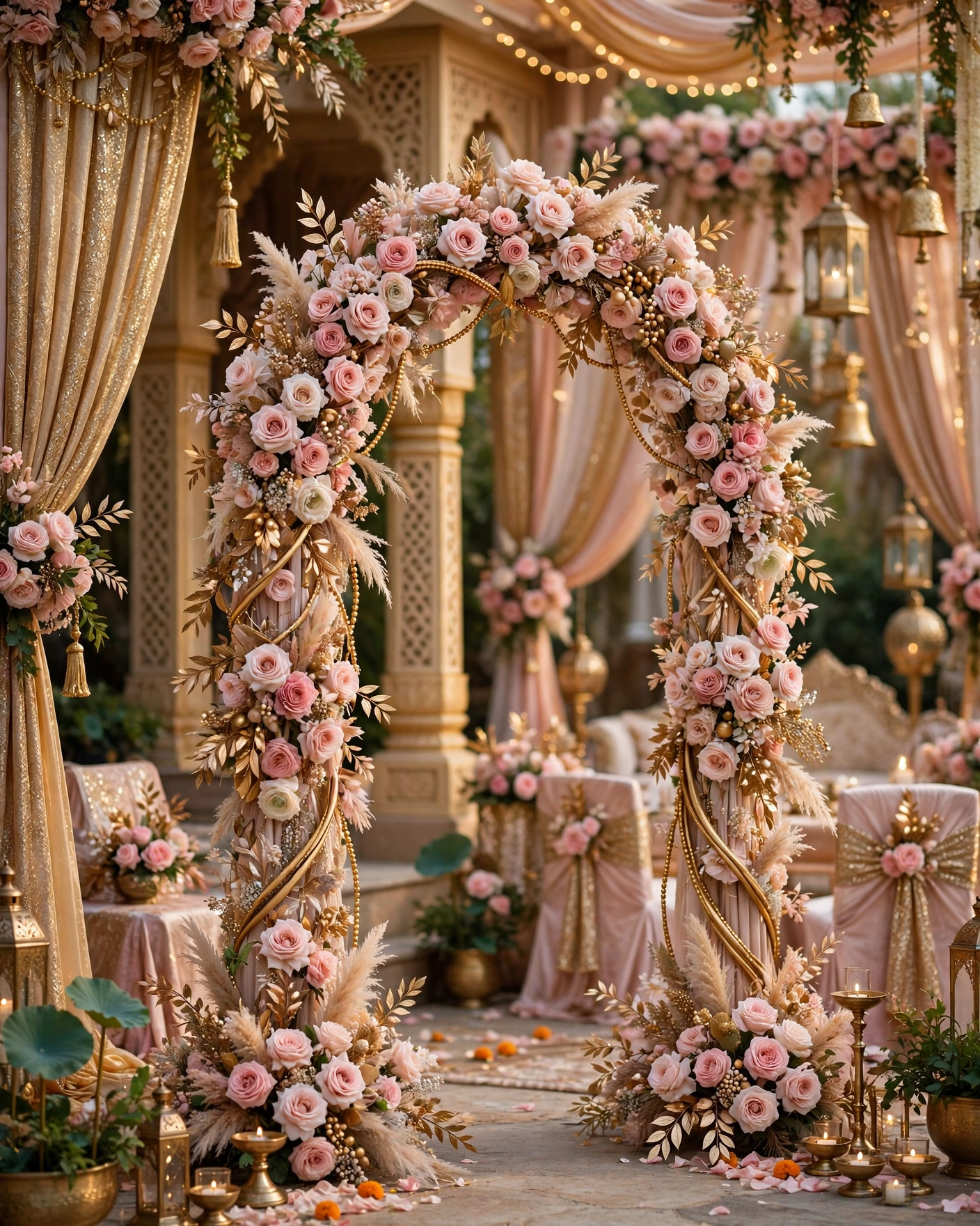
Coordination means the invitation and the wedding look like they belong to the same celebration. The colours match, the flowers in the invitation echo the flowers at the venue, and the mood is the same in both places. Guests may not name the link, but they feel it.
Without coordination, the invitation promises one wedding and the venue delivers another. A pastel invitation followed by a deep red venue feels confusing, even if both are beautiful alone. Coordination is simpler than it sounds: one palette, one motif, one mood, decided once and shared with everyone.
The three decisions to make first
Start with the invitation, not the venue, because the invitation is designed first in most weddings. It is easier to match decor to an invitation than to redesign an invitation around decor that is already ordered. Agree two main colours and one accent, pick one motif, and name the mood in two or three words.
That one page is your reference sheet. It stops the decorator choosing a different pink from the florist, and it stops the invitation designer guessing the mood from a phone call. If a vendor suggests something that does not fit the sheet, the sheet is the answer.
Palettes that travel from card to venue
A palette only works if it survives in real light, on real fabric, and in real flowers. These six pairings travel well from a phone screen to a venue hall.
Blush, gold and ivory
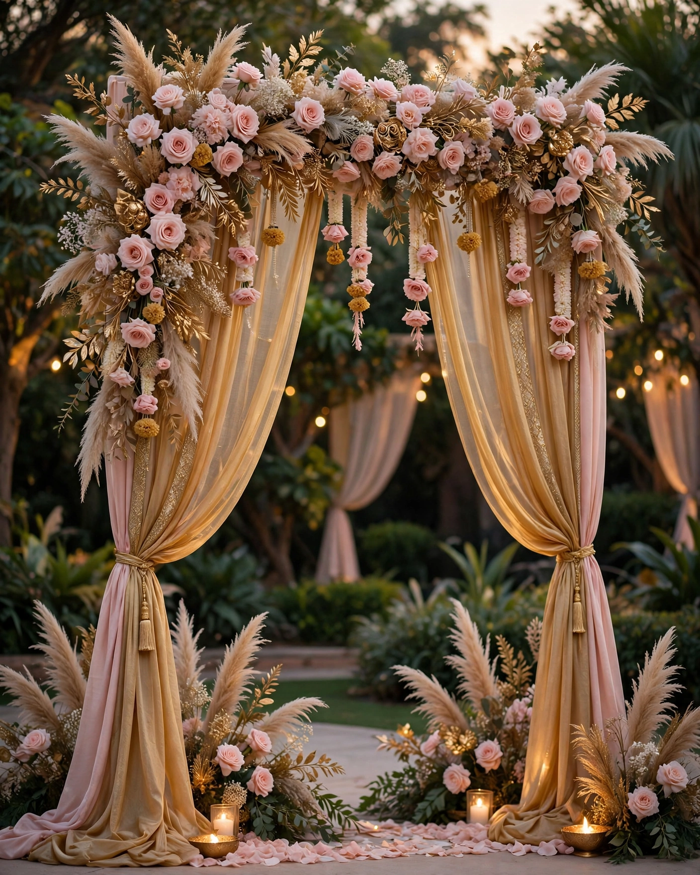
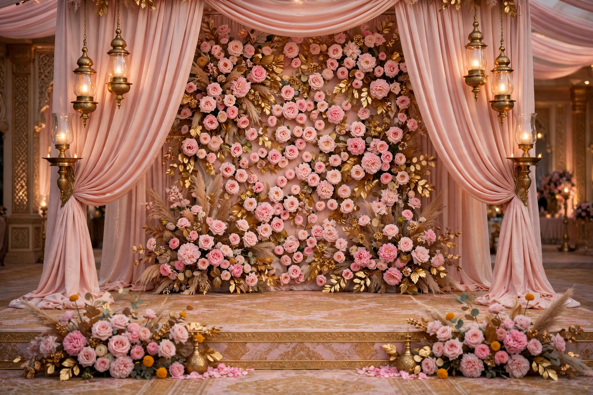
Blush and gold on ivory is the soft romantic pairing, and it suits evening receptions and palace halls. Use blush in the borders and the drapes, gold in the lettering and the brass lamps, and ivory as the calm background.
Burgundy, antique gold and cream
Burgundy with antique gold and cream is the royal pairing, and it suits winter weddings and heritage venues. Keep burgundy on the stage backdrop and the invitation cover, gold on the motif and table details, and cream on linen.
Sage, ivory and brass
Sage and ivory with brass is the calm garden pairing, and it suits daytime weddings, lawns, and courtyards. Use sage in foliage and drapes, ivory in flowers and linen, and brass in lamps and vessels.
Marigold, terracotta and cream
Marigold and terracotta on cream is the warm festive pairing, and it suits haldi, mehndi, and daytime family ceremonies. Marigold garlands at the venue echo marigold artwork on the invitation, while terracotta pots and cream fabric keep the look earthy.
Pastel peach, mint and gold
Pastel peach and mint with a touch of gold is the light, playful pairing, and it suits spring weddings and garden venues. Keep both pastels pale and let gold do the framing, on the invitation border and the stage edge.
Midnight blue, gold and ivory
Midnight blue with gold and ivory is the evening drama pairing, and it suits sangeet nights and receptions under lights. Use midnight blue on the invitation background and stage drapes, gold on the lettering and fairy lights, and ivory on flowers.
Motifs, flowers and moods that match
Colour alone is not enough. A motif or a flower carried from the invitation to the venue is what makes guests feel the link without thinking about it.
The paisley, from card to stage
A paisley motif on the invitation can reappear on the stage backdrop, the table runners, and the welcome board. Use it large in one place and small everywhere else, so it reads as a thread.
The arch, from cover to entrance
An arch shape on the invitation cover can become a real arch at the venue entrance, dressed with the same flowers as the invitation artwork. Guests walk through the shape they saw on their phones, so keep the flowers and colours identical.
The mandala, from border to floor
A mandala border on the invitation can become a rangoli or a floor design at the entrance, in the same colours. This suits traditional ceremonies and morning events, so keep the design simple enough to read at a glance.
The marigold echo
If marigold is the main flower at the venue, put marigold artwork on the invitation too, in the same shade of orange and yellow. Guests have already seen the colour, so the venue feels familiar the moment they arrive.
The rose and jasmine pairing
Roses and jasmine on the invitation suit a romantic, fragrant venue with the same flowers on tables and around the stage. Confirm both flowers are in season first.
The mood match, royal with royal
A royal invitation belongs with a royal venue, and a garden invitation belongs with a garden venue. Name the mood on the reference sheet, royal, romantic, playful, or calm, and check every vendor choice against it.
The coordination timeline
- Six months before: agree the palette, motif, and mood, and finalise the invitation design.
- Three months before: share the reference sheet with the decorator and florist, and confirm the main flower is in season.
- Six weeks before: send the invitation, so guests can plan outfits around the palette.
- Two weeks before: check the decor colours against the invitation in real light at the venue.
- The week of the wedding: walk the venue with the reference sheet, and check the entrance, stage, and tables against the invitation.
Common mistakes to avoid
The first mistake is choosing the palette from a phone screen alone. Colours shift in hall light, in sunlight, and on fabric, so check swatches and flowers at the venue before ordering. The second is letting each vendor choose their own shade, which is how three different pinks end up in one room.
The third mistake is matching the invitation to the decor after the decor is ordered, which usually means redesigning the invitation in a hurry. Decide the invitation first, and let the decor follow it. The fourth is adding a new colour at the last minute because a relative loved it.
Your coordination checklist
- Palette agreed: two main colours and one accent, written down
- One motif chosen, for both the invitation and the decor
- Main flower confirmed in season, and echoed in the invitation artwork
- Mood named in two or three words, and shared with every vendor
- Reference sheet given to the decorator, florist, and invitation designer
- Colours checked in real light at the venue, two weeks before the wedding
- Invitation sent early, with the dress code mentioned briefly if it helps guests
Frequently asked questions
When should we start coordinating the invitation and decor?
Six months before the wedding is a good time. Agree the palette, motif, and mood, finalise the invitation first, and then share the reference sheet with the decorator and florist.
What if our venue already has strong colours?
Work with them, not against them. Pick a palette that sits happily beside the venue's walls and floors, and test your swatches in the venue's own light.
Should the printed card match the digital invitation?
Yes, if elders receive a printed card, keep its palette and motif identical to the digital invitation. Two different cards tell guests there are two different weddings.
How do we coordinate without spending more?
Coordination is a decision, not a purchase. One palette, one motif, and one reference sheet cost nothing, and they often save money, because vendors stop ordering colours and flowers that do not fit the plan.
What if the decorator and florist disagree?
Go back to the reference sheet. The sheet is the decision the family already made, so the question is which option matches it. If neither does, pick the closer one and move on.
Related reading
- Indian Wedding Planning Checklist: 12 Months to the Wedding Day
- Wedding Invitation Wording: Examples for Every Function
Decide the palette, the motif, and the mood once, share them with every vendor, and let the invitation and the venue tell one story on MyIndiAura.
See it on a real invite
Open any of these to see the full invite, then add your own names and preview it free.

Found this useful? Share it with someone planning a celebration.
Share