Best Wedding Colour Combinations for Indian Weddings
Indian weddings love colour, but the best combinations use restraint. Two main colours and one accent will always look better than every colour at once.
Why two colours and one accent win
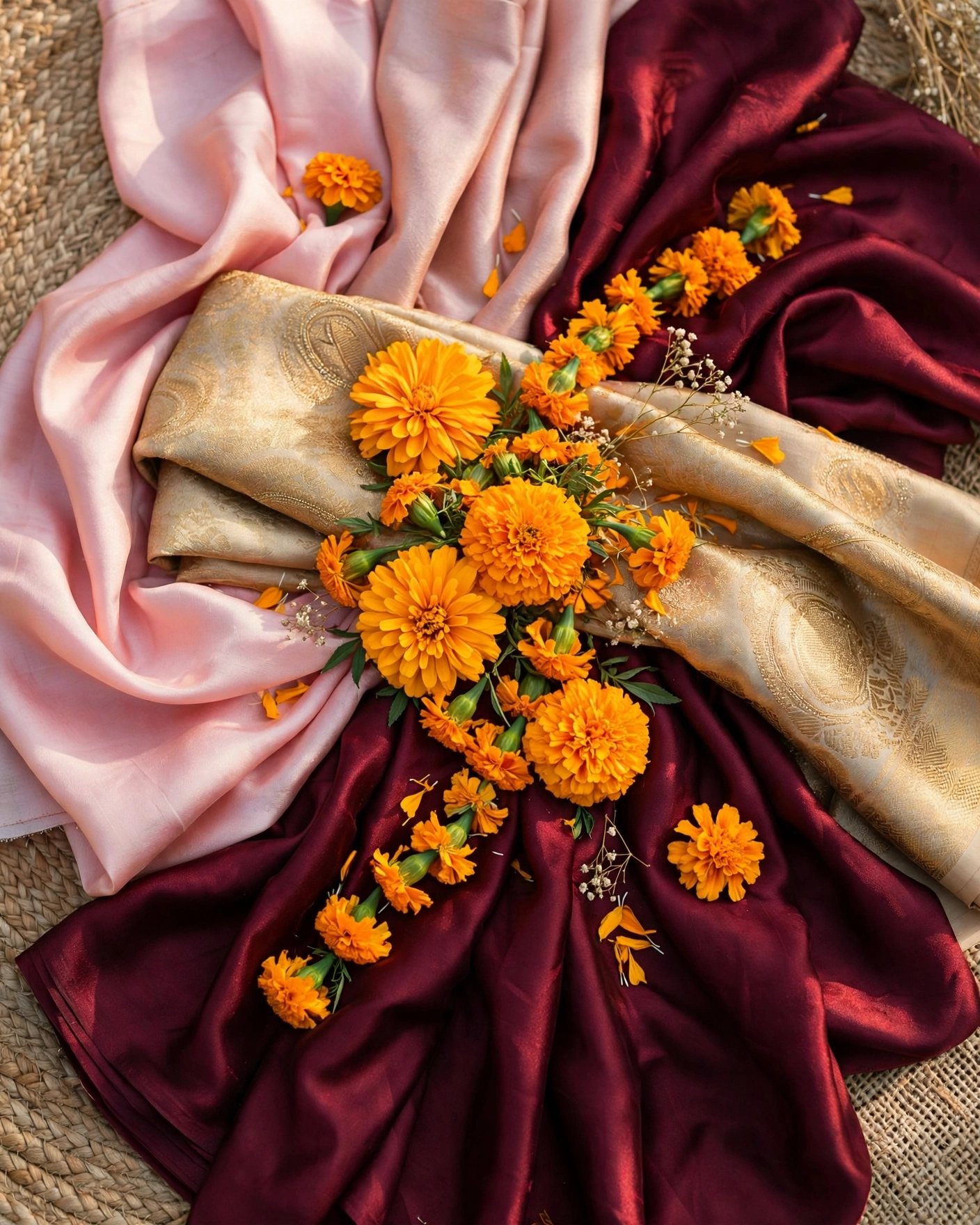
Colour is the fastest way to set a wedding's mood. Deep reds feel traditional and auspicious. Pastels feel soft and romantic. Jewel tones feel rich and dramatic. But colour only works when it is disciplined. A wedding that uses every bright colour ends up with no colour identity at all.
The combinations below have lasted because they balance warmth with calm. Each one pairs a strong colour with a soft one, so the eye has somewhere to rest. Use them as starting points, then adjust for your venue, season, and family taste.
Twelve combinations that work
Red and gold
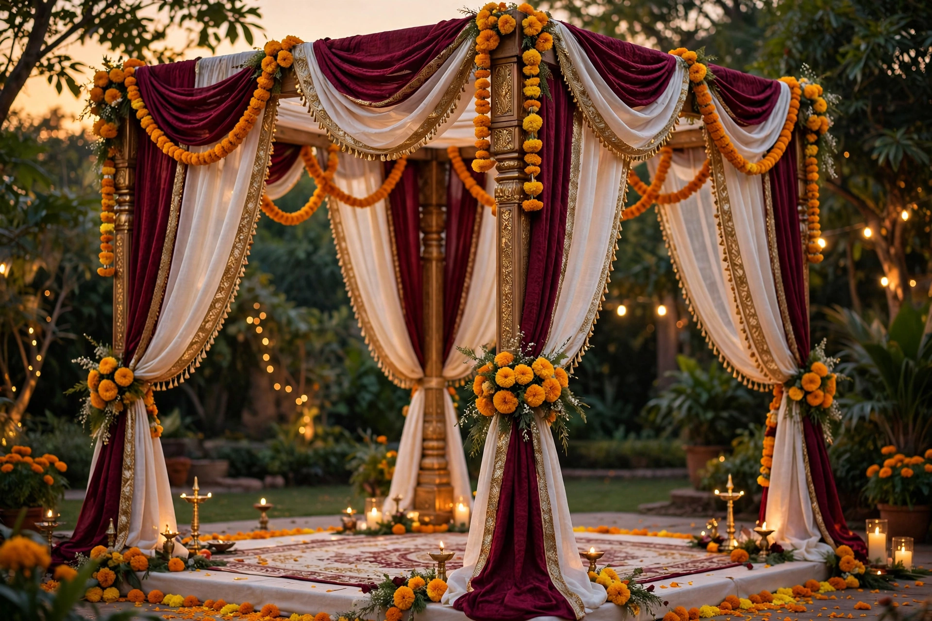
The classic. Deep red with antique gold suits traditional ceremonies and evening events. Tip: keep the gold to one shade, so the combination reads rich instead of busy.
Blush and sage
Soft pink with muted green. Modern, romantic, and kind to photographs. Tip: blush needs warm light. Cold white lighting can make it look grey in photographs.
Burgundy and ivory
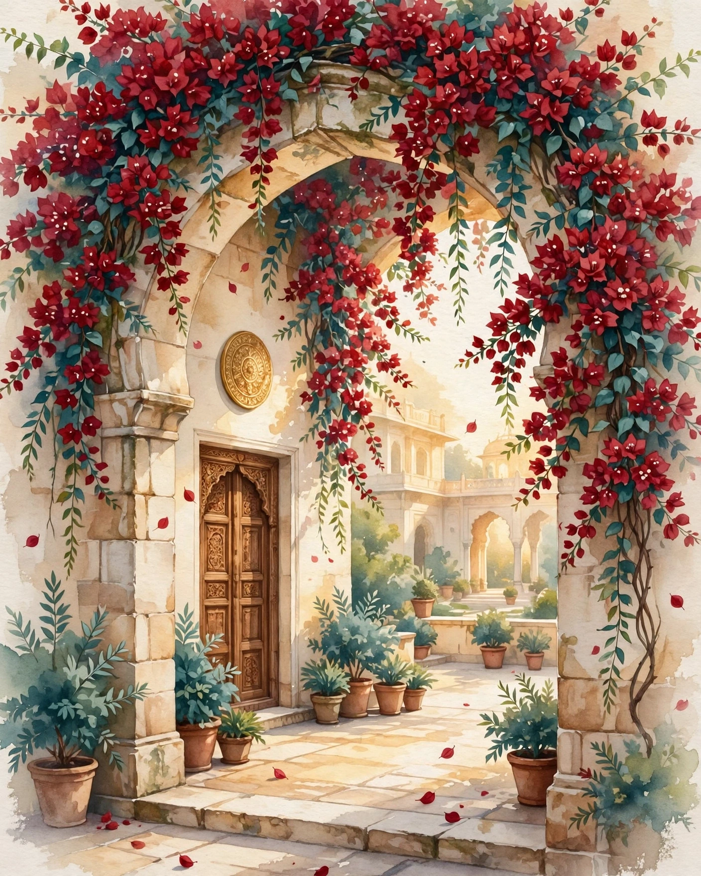
Rich and elegant. Ideal for palace venues and winter weddings. Tip: use ivory for the largest surfaces, so burgundy stays an accent rather than a wall.
Teal and gold
Deep teal with gold accents. Striking without being loud, and lovely in evening light. Tip: teal suits evening events best. In harsh daylight it can look darker than you expect.
Pastel peach and cream
Gentle and bright. Best for daytime and garden weddings. Tip: check pastel text on a phone in sunlight, since pale colours can wash out outdoors.
Emerald and ivory
Jewel green with soft white. Regal, fresh, and photogenic. Tip: emerald photographs best in evening light, so schedule the main portraits at dusk.
Maroon and mustard
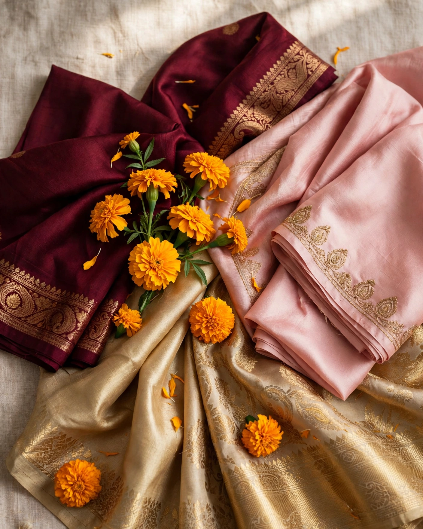
Deep maroon with warm mustard, the colours of marigold season. Traditional, warm, and joyful. Tip: mustard is the accent here, not the equal partner. A little mustard goes a long way.
Lavender and silver
Soft lavender with silver thread, calm and modern. Suits evening receptions and couples who want colour without heat. Tip: lavender needs candlelight or warm lamps beside it, or the evening can feel cold.
Rust and cream
Warm rust with cream, earthy and elegant. Suits autumn weddings and venues with stone or wood. Tip: rust is a strong colour, so use it for outfits and flowers, and keep the venue surfaces cream.
Navy and blush
Deep navy with soft blush, formal and romantic at once. Suits city hotels and evening ceremonies. Tip: navy grounds the blush, so use navy for the larger elements and blush for the flowers and details.
Pink and mint
Bright pink with cool mint, fresh and playful. Suits sangeet and daytime events. Tip: keep the pink to one shade, since two pinks plus mint turns the palette into a third colour by accident.
Orange and ivory
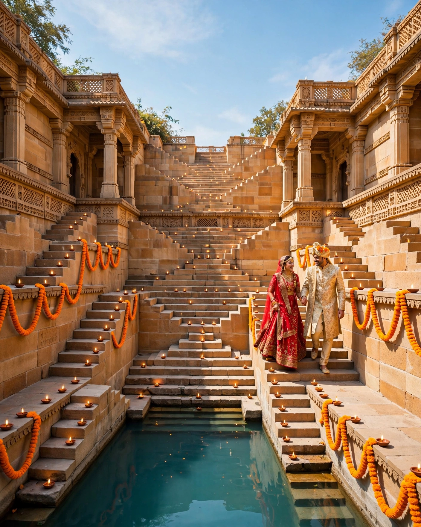
Marigold orange with ivory, the colours of a temple morning. Warm, auspicious, and photogenic. Tip: orange photographs beautifully in daylight, so use this combination for morning ceremonies.
Testing a palette before you commit
Test the palette three ways: on the invitation, on an outfit, and at the venue. A combination can look perfect on screen and harsh under venue lights, or beautiful in silk and flat in flowers. The invitation test is the cheapest one, so do it first.
Also agree the palette with both families early. Colour arguments late in planning are rarely about colour. They are about feeling included. One early conversation saves many later ones.
Carrying the palette through the wedding
Once the palette is final, write it down and share it with every vendor. Two main colours and one accent colour, written down and shared with vendors. Venue photographs in the light of your ceremony hour. Outfit plans for the couple and close family, checked against the palette. Flower options in season, in your colours. The invitation design, matched to the palette. A note for guests, if a dress code follows the palette.
Share the invitation once the palette is final, so guests can plan outfits, and keep the same invitation for all guests, so the palette story stays consistent.
Before you commit to a palette
- Two main colours and one accent colour, written down and agreed
- The palette tested on the invitation, on an outfit, and at the venue
- Flower options in season, in your colours, confirmed with the florist
- Outfit plans for the couple and close family, checked against the palette
- Venue photographs in the light of your ceremony hour
- Both families consulted early, so colour never becomes a proxy argument
Mistakes that make colour fail
The first mistake is every colour at once. A wedding that uses every bright colour ends up with no colour identity at all. The second mistake is testing only on screen. A palette can look perfect on a phone and harsh under venue lights, or beautiful in silk and flat in flowers. The third mistake is deciding late. A palette agreed after outfits are bought and flowers are ordered is not a palette. It is an apology.
Frequently asked questions
How many colours should a wedding palette have?
Two main colours and one accent. Two colours give the wedding an identity, and one accent gives it life. More than that, and guests stop seeing colour and start seeing noise.
What is the safest colour combination for an Indian wedding?
Red and gold, or burgundy and ivory. Both have lasted for generations because they balance warmth with calm, suit traditional ceremonies and evening events, and photograph beautifully in almost any light.
Should the invitation match the wedding palette?
Yes. Test the palette on the invitation first, since it is the cheapest test. If the combination looks right on the invitation, it will usually look right at the venue too, and guests will recognise the palette the moment they arrive.
How do we choose colours for different events?
Keep one palette for the week, and shift the balance per event. Haldi can lean yellow, mehendi can lean green, and the wedding can lean red, all inside the same two colours and one accent. The week feels varied, but the story stays one story.
What if our families disagree on colours?
Agree the palette early, in one conversation, with both families present. Colour arguments late in planning are rarely about colour. They are about feeling included, and one early conversation saves many later ones.
Related reading
- Indian Wedding Planning Checklist: 12 Months to the Wedding Day
- Mehendi Night Ideas: Themes, Decor and Timelines That Actually Work
Create your wedding invitation on MyIndiAura, and let two colours and one accent carry the whole celebration.
See it on a real invite
Open any of these to see the full invite, then add your own names and preview it free.
Found this useful? Share it with someone planning a celebration.
Share