Modern Engagement Invitation Designs for Couples
Modern engagement designs are clean, confident, and personal. They use one strong idea, generous space, and clear type, so the couple and the date stand out.
Modern means one clear idea
Modern engagement design means restraint. One palette, one motif, and plenty of space around the names and the date. The couple stands out because nothing competes with them, and the date is readable at a glance on a phone.
The design should reflect the couple, not just the season. A shared interest, a favourite colour, or a place that matters to both of you can carry the whole invitation.
Clear type matters more than decoration. If guests cannot read the date at a glance, the design has failed. Choose one idea, and let everything else serve it.
Quiet and spacious designs
Minimal floral
One flower, or one small cluster, with clean space around it. This suits a daytime or garden engagement, and couples who love elegance without fuss. Keep the flower small and the background pale, so the names stay the largest thing on the card.
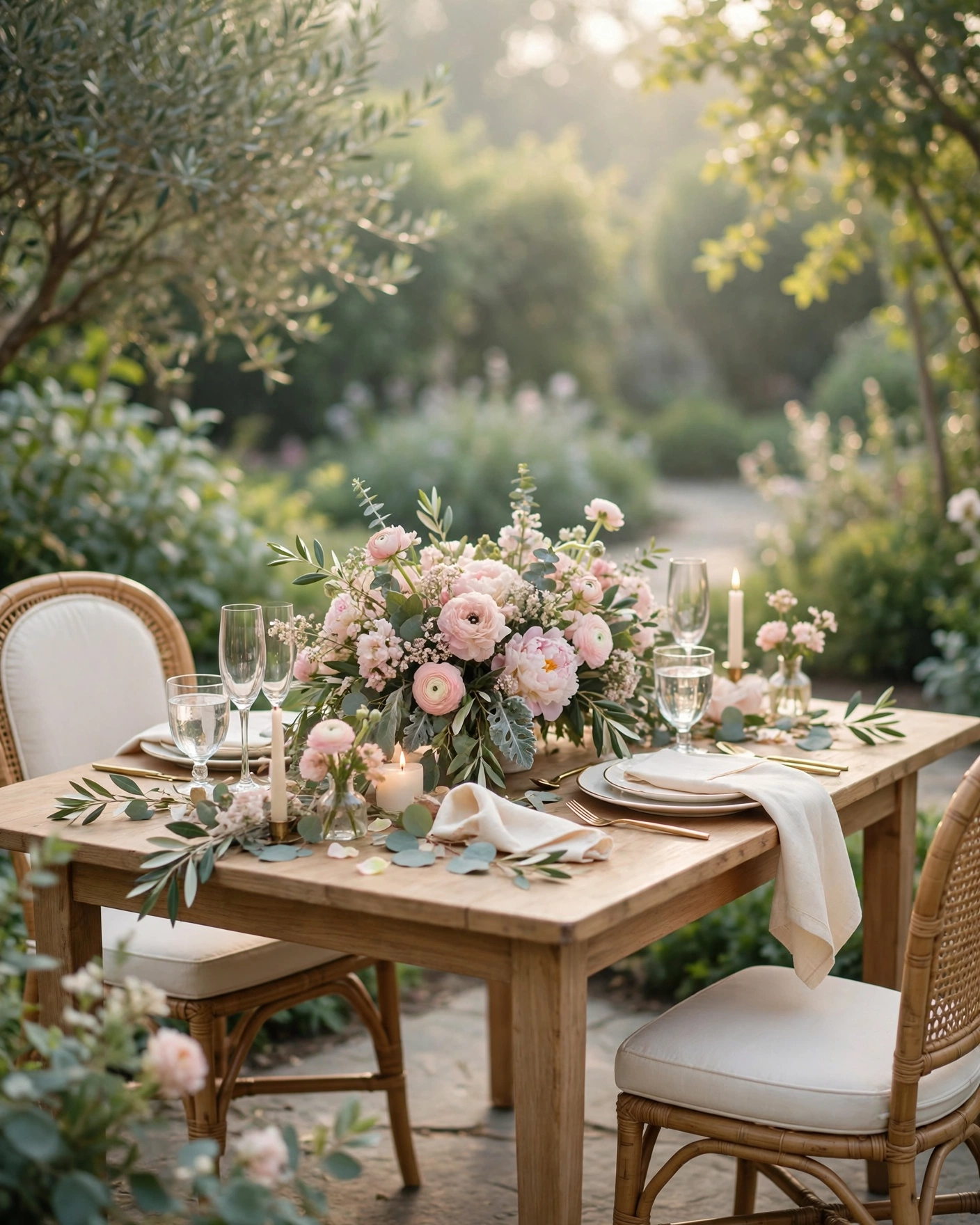
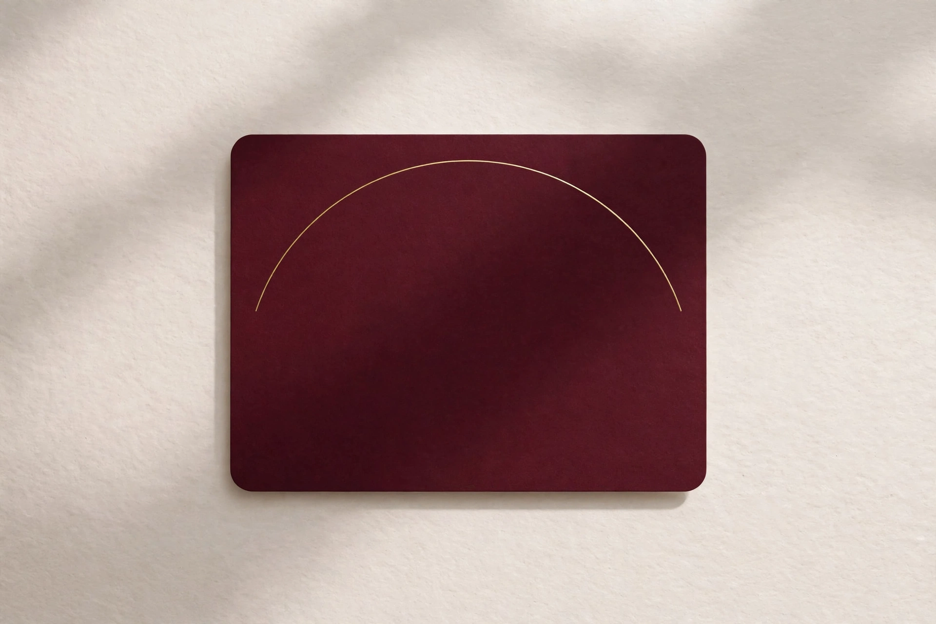
The single arch
A single thin gold arch on a plain ivory background, with the couple names large in the centre. This suits a modern venue and a couple who love clean lines. The arch gives the card its shape, and the empty space around it gives the names room to stand out. Ask for the arch to be fine, not heavy, so it frames the names without crowding them.
Pastel wash
Soft blush, sage, or ivory, washed lightly across the card, with the names in a deep, calm colour. This suits a morning or afternoon ceremony, and couples who want colour without heaviness. Keep the wash lightest behind the date and venue, so the details stay easy to read.
The quiet monogram
The couple initials, drawn once, large and simple, at the top of the card. This suits a couple who want something personal without a photo or a flower. Keep the monogram to one style, and repeat it once, small, near the date, and no more.
Bold and confident designs
Deep burgundy block
One strong colour, deep burgundy, with white or gold type over it. This suits an evening engagement, and a couple who want the card to feel confident from the first glance. Keep the type large and the layout simple, because a bold background needs bold, clear lettering to stay readable.
Teal and gold
Deep teal with fine gold lines and a single geometric motif. This suits a city venue and a couple who like colour with structure. Pair it with a photo in warm light, or let the colour carry the card on its own, and keep the gold to the frame so the names stay clear.
Terracotta and cream
Warm terracotta with cream type and a single arch or circle motif. This suits a couple who love earthy, modern colour, and a ceremony with natural decor. The warmth of the terracotta makes the card feel inviting, while the cream type keeps it calm.
Midnight and gold
Deep navy or near black, with gold type and a single shining detail. This suits a glamorous evening party, and couples who love drama. Place the date and venue on a plain panel within the dark background, because light text on a busy dark pattern is hard to read.
Personal and photo led designs
The favourite photo
One beautiful photo of the couple as the main visual, with simple type over a soft overlay. This suits couples with a favourite photo from the proposal or a recent shoot. Pick a photo with clear faces and soft light, and keep the text short so it never covers a smile.
The place that matters
A photo or illustration of a place that matters to the couple, a street, a garden, a college, or a city skyline, with the names over a plain panel. This suits couples whose story is tied to a place. Keep the place image soft and the text panel plain, so the details stay readable.
The shared interest
A single motif drawn from something the couple loves, music, books, travel, or sport, used once and with restraint. This suits a couple who want the card to feel personal without a photo. Choose one motif only, and let it appear once, large, and once, small, so the card feels designed rather than decorated.
The hand written line
One line in a hand written style, a short phrase from the couple, over an otherwise clean card. This suits a couple who want warmth in a modern design. Keep the hand written line short, and put the date and venue in clear, plain type, so the personal touch never hides the practical details.
Wording that fits a modern card
Modern wording is short, plain, and confident. These lines are ready to adapt, with your own names and date in place of the brackets.
- [Name] and [Name] are getting engaged, and we would love you to be there. [Date], [Venue].
- Two rings, one promise. Please join us on [Date] at [Time].
- With joy, we invite you to celebrate the engagement of [Name] and [Name] on [Date].
- Save the date. [Name] and [Name], [Date], [Venue]. Dinner and dancing to follow.
- We are engaged, and the celebration starts with you. [Date], [Time], [Venue].
Put the names, date, venue, and time first. A modern card earns its style by saying less, clearly.
Matching the design to the venue and the light
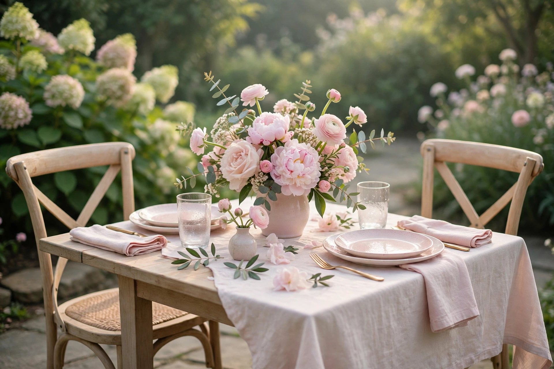
A design that looks perfect on a laptop can fail on a phone, so match it to the venue and the light. A dark, moody design looks best for an evening event, where the lighting is warm and low. A light, pastel design suits a daytime garden or home ceremony, where sunlight does the work.
Before you send it out
- The couple names, and how they should appear, full names or first names
- The date, time, and venue, confirmed before design work begins
- A favourite photo, if the design is photo led, in good light and high quality
- The colour palette the couple loves, and any colour to avoid
- The hosts names, if they appear on the invitation
- The dress code, if guests need to know it in advance
- A preview on a phone, checked in daylight and in a dim room, by two people
Frequently asked questions
What makes an engagement design modern?
Restraint, one palette, one motif, and plenty of space around the names and the date. Modern design is not less decoration. It is decoration with a decision behind it, and clear type that guests can read at a glance.
Can a modern design still use traditional colours?
Yes. Marigold, rose, and gold all work in a modern design, when they are used sparingly as accents rather than as a full frame. One gold line or one flower, used with intent, keeps the card modern and warm at once.
Should a modern engagement invitation include a photo?
A photo works well when you have a favourite in good light, and the design gives it room. If no photo feels right, a single motif, a monogram, or a clean colour block carries the card just as well.
How do we choose between two modern designs we both like?
Show both to two people whose taste you trust, and notice which one they pause on. If both still feel equal, pick the one where the date is easiest to read on a phone, because that is the design guests will actually use.
When should we send a modern engagement invitation?
Send it two to three weeks before the ring ceremony, so outstation guests can plan travel. A short reminder two days before, with the date, time, and venue in plain text, helps guests who may have missed the first message.
Related reading
- Wedding Invitation Video Trends for 2026
- Mehendi Night Ideas: Themes, Decor and Timelines That Actually Work
Create your engagement invitation on MyIndiAura, in a modern design that feels like the two of you.
See it on a real invite
Open any of these to see the full invite, then add your own names and preview it free.
Found this useful? Share it with someone planning a celebration.
Share