How to Create a Luxury Wedding Invitation Without Spending a Fortune
Luxury is not a price tag, it is restraint, good light and one beautiful detail done well, and this guide shows how to get that feeling at a digital invitation price.
The secret in one line
Luxury comes from restraint, a limited palette, generous space and one striking detail, not from expensive materials. A digital invitation can look truly premium for a fraction of printed luxury, because design, not paper, carries the feeling. Choose one hero image, one type style and one colour story, and let them breathe.
A luxury wedding invitation feels calm, rich and considered. It does not shout. It uses deep colour, soft light, fine detail and plenty of empty space. In print, that feeling costs a great deal, because it depends on thick paper, foil and hand finishing. In digital form, the same feeling comes from design choices that cost little: a strong composition, a refined palette, a beautiful photograph and gentle motion.
Four forms of luxury
Luxury takes a few forms. A classic luxury design uses serif lettering, gold detail and a palace or floral arch. A modern luxury design uses clean lines, one strong colour and generous white space. A royal heritage design uses deep jewel tones, arches and traditional motifs. A minimal luxury design uses almost nothing, one flower, one name, one date, and lets the emptiness feel confident. Pick the form that matches your venue, because luxury that fights its setting feels false.
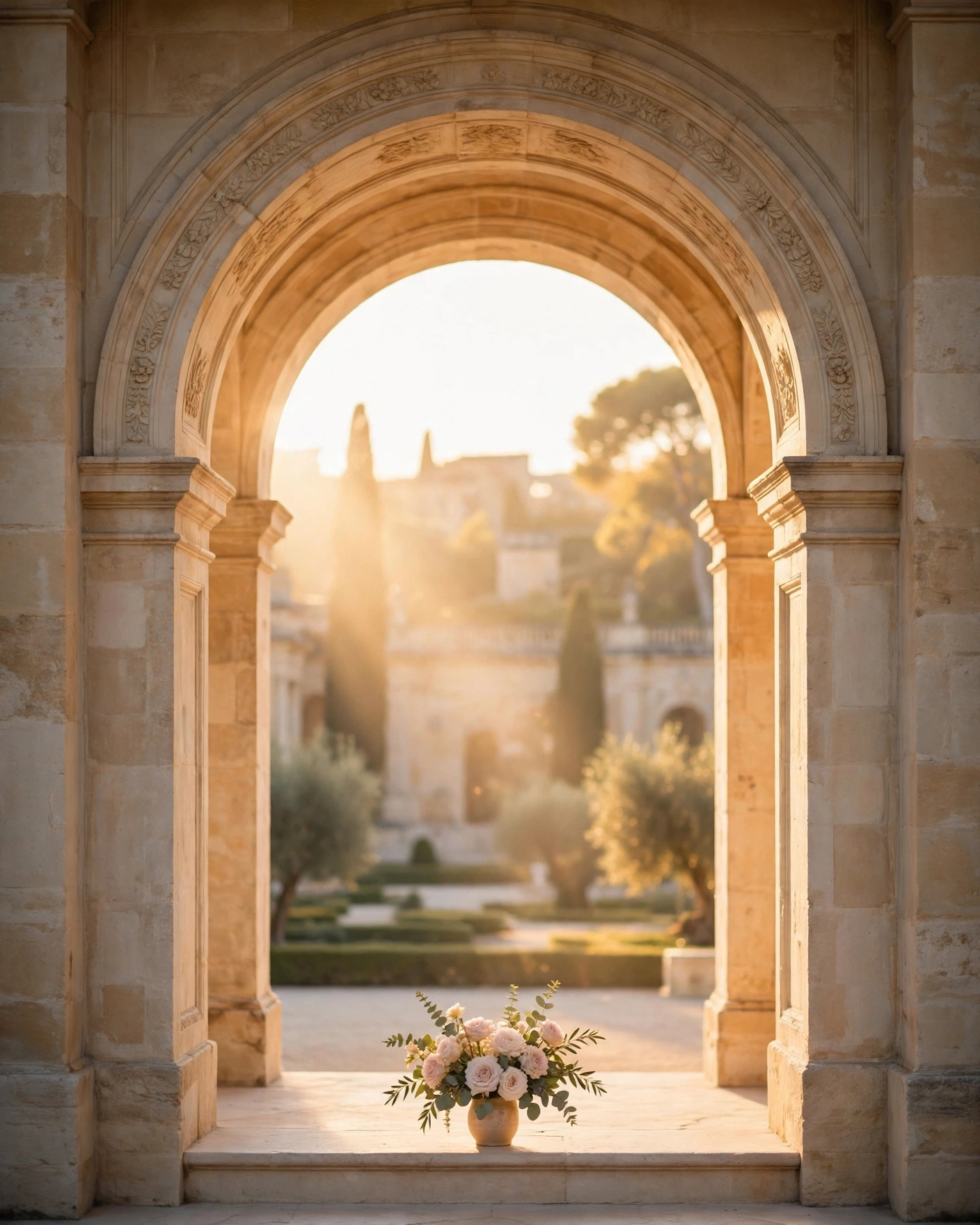
Restraint, the whole secret
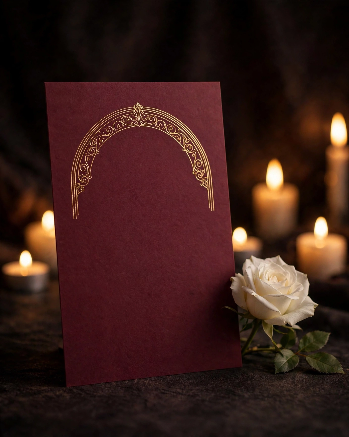
Restraint is the whole secret. Limit yourself to two colours plus gold. Use one photo you truly love, not six average ones. Keep names large and readable, and keep decoration away from the words guests must read. Use warm light in photos, and avoid harsh flash. If you are unsure whether to add one more effect, leave it out. Luxury is what remains when everything unnecessary is removed.
Luxury is not what you add. It is what you have the confidence to leave out.
Light, photo and motion
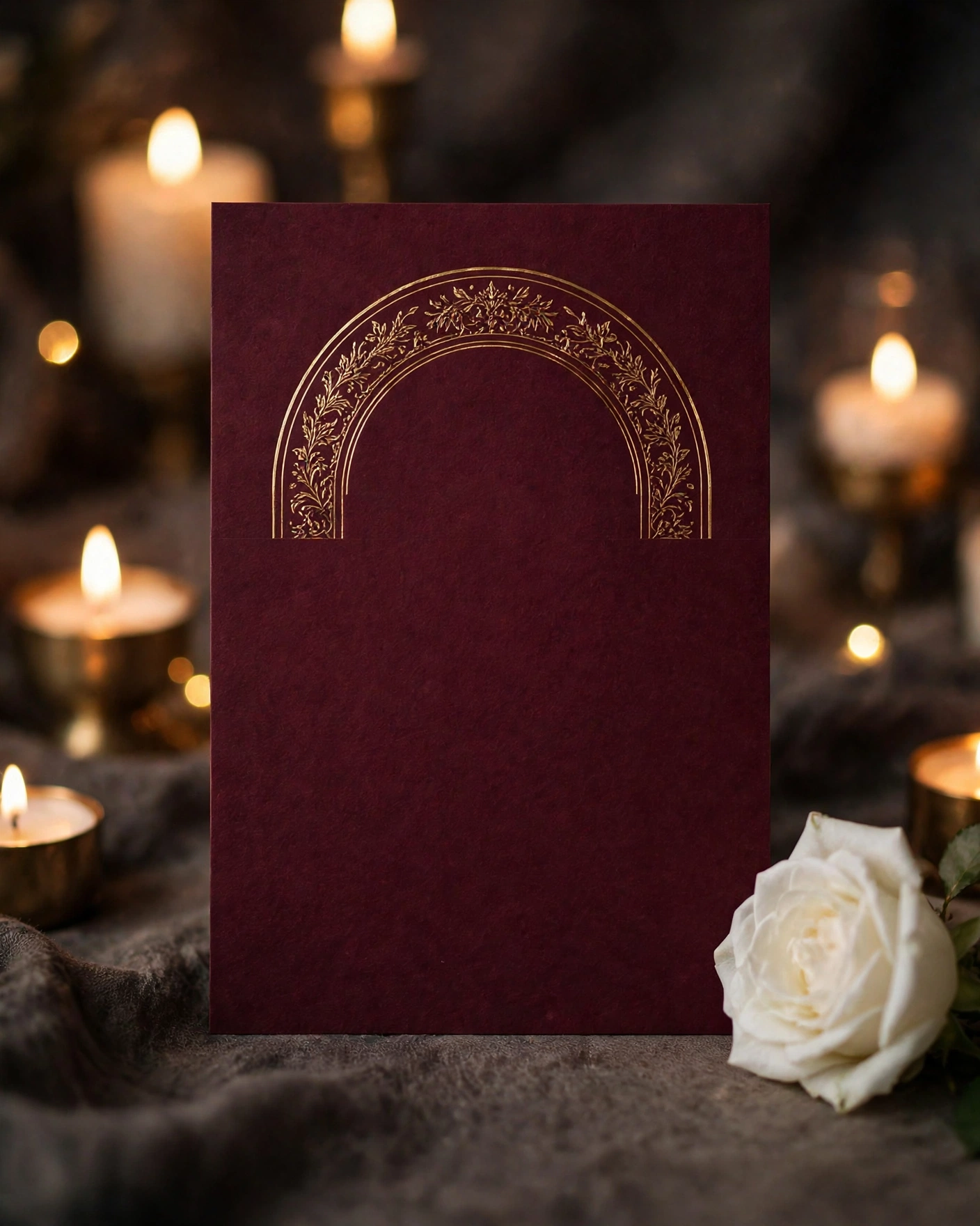
A refined design uses deep burgundy, warm ivory and antique gold, with restraint. The hero image needs soft light and one clear focal point. Motion should feel expensive: slow fades and drifting petals, never flashing effects. And the whole thing must look as good on a phone as a printed card looks in hand, because that is where guests will see it.
Where to save, and where to spend
Spend your attention on one outstanding photo in soft natural light, a palette of two colours plus gold agreed before designing, final names, dates and venues spelled correctly, and a short welcome line, elegant and plain. Save everywhere else: extra effects, extra photos, extra colours. A premium digital invitation costs ₹99 to ₹499 depending on the format you choose, so the luxury here is a design decision, not a bigger bill.
The phone check, and sending it well
Check the invitation on a phone in daylight and in dim light. Send to family first, and ask whether it feels premium or busy. Share personally with honoured guests, not only in groups. Send once, beautifully, rather than sending drafts repeatedly.
Create your luxury invitation on MyIndiAura, with one photo, one palette and one striking detail, and share a finished invitation you are proud of.
Six luxury touches that cost little
Generous white space
Empty space is the cheapest way to look expensive.
One metallic colour
A single gold or champagne accent, rather than many colours.
A serif for the names
A classic typeface gives instant elegance.
One beautiful photograph
A single, well-lit image instead of a collage.
A slow opening
A gentle reveal, like a door or envelope, feels premium.
Fewer words
Short, confident lines read as luxury; long paragraphs do not.
Spending where it shows
- Put most of the budget into one hero element, such as a film opening or a fine photograph.
- Keep every other screen simple and consistent.
- If printing, print a small number on heavy paper for elders.
- Use the digital invite for everyone else.
Before you send
- One accent colour across the whole invitation
- Names in a refined typeface, large and clear
- No crowded screens
- It looks as good on a phone as on a laptop
A luxury invitation is mostly about restraint. When in doubt, remove something: one less flower, one less line of text, one less font. Guests read calm confidence as expense, and they read clutter as effort.
Frequently asked questions
How can a cheap invitation look luxurious?
Use space, one metallic accent, a classic serif and a single strong image.
What colours look most luxurious?
Ivory, champagne, deep emerald, navy and burgundy with one gold accent.
Is a digital invitation less luxurious than printed?
Not if it is designed well. A cinematic digital invite can feel more premium than a busy printed card.
Where should I spend if I have a small budget?
On the opening and the photograph, the two things guests notice first.
Related reading
See it on a real invite
Open any of these to see the full invite, then add your own names and preview it free.


Found this useful? Share it with someone planning a celebration.
Share