Elegant Birthday Invitation Designs for a Luxury Party
Luxury in an invite is not gold everywhere. It is space, restraint, and one beautiful detail done perfectly.
Luxury whispers, it never shouts
A luxury birthday invitation does not announce itself. It does not need gold on every corner, or a long list of adjectives, or a design that tries too hard. Luxury is restraint: thick paper, empty space, one strong idea, and type so clean it looks inevitable. The guest should feel the occasion before they read a word.
The twelve designs below are grouped by mood: quiet and classic, deep and dramatic, and modern and minimal. Each one is a complete look, with colours, type, and one practical tip, so you can pick one and build the invitation around it.
Quiet and classic luxury
Ivory and gold
Ivory, a thin gold border, and the birthday person's name in an elegant serif. This suits a fiftieth, a sixtieth, or a formal dinner, where the evening is the event. Keep the gold to the border, because a little gold whispers and a lot of gold shouts.
The monogram
The birthday person's initials in a beautiful monogram, large on the card, with the party details below in small, clean type. This suits a milestone birthday, because the monogram is personal and timeless. Keep the monogram to one colour, gold or deep navy, because a monogram in two colours looks busy.
Botanical line art
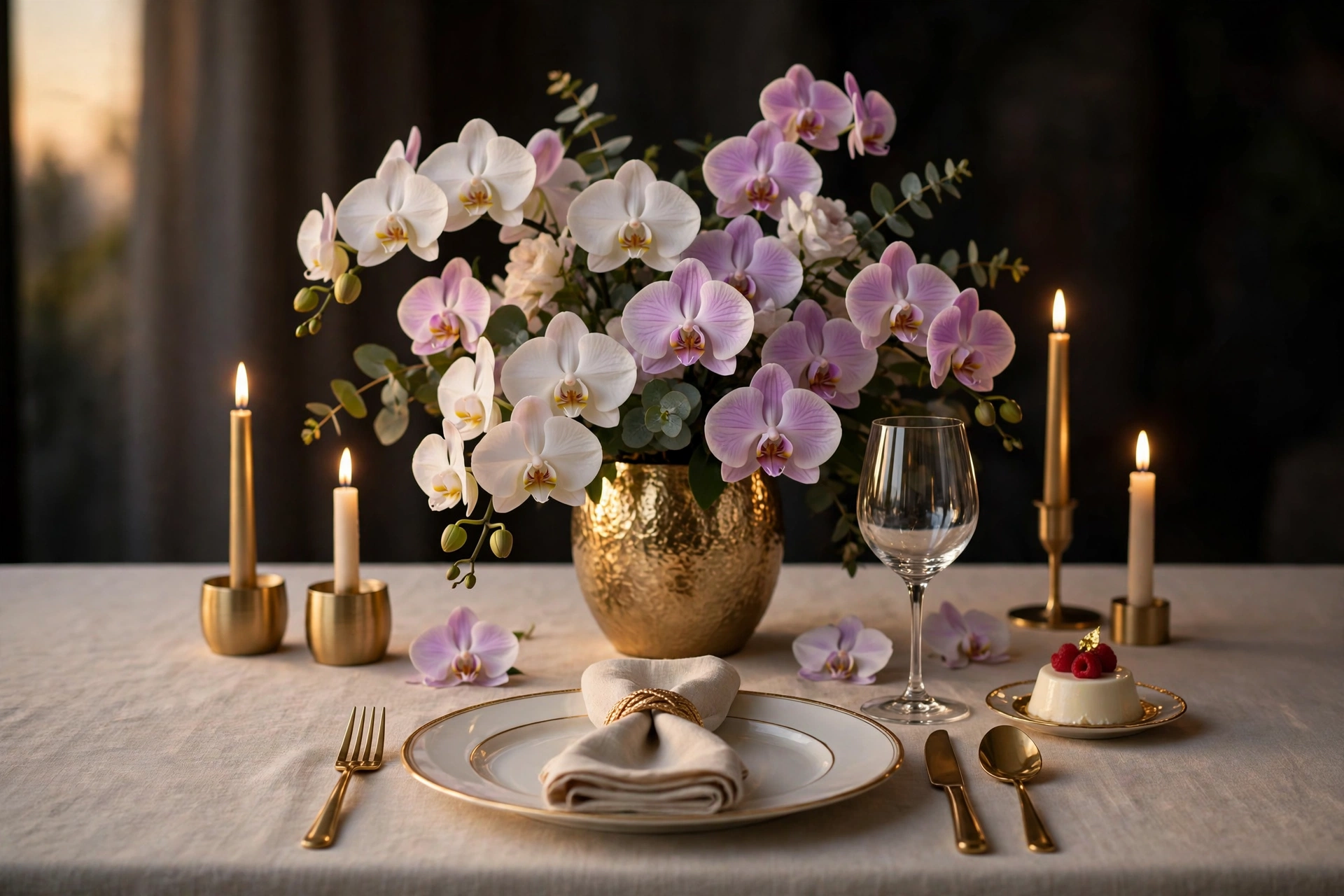
An ivory ground, delicate botanical line art and a clean serif typeface. This suits a grown-up birthday lunch, a garden party, or a fiftieth with a daytime celebration. The restraint is the point, so resist adding colour.
Deep and dramatic luxury
Burgundy and gold
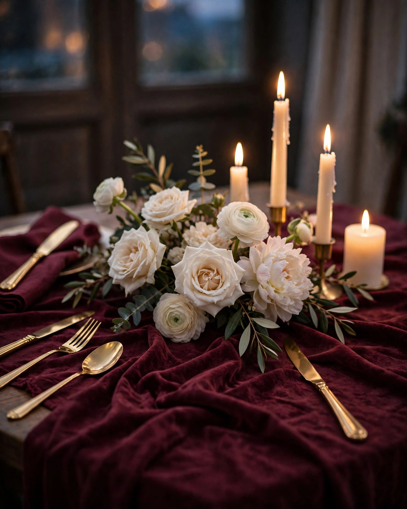
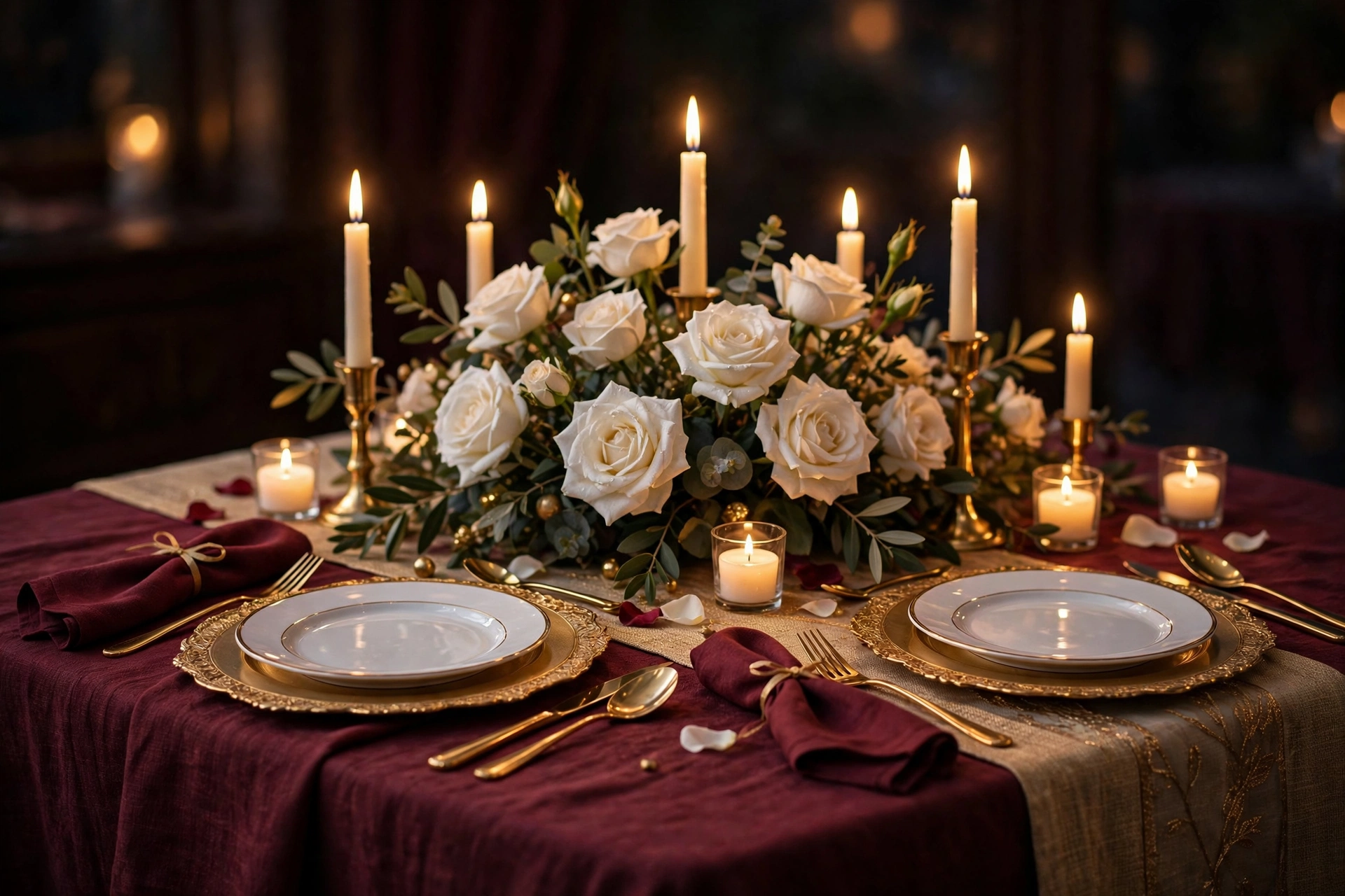
Deep burgundy, gold type, and a candlelit mood. This suits an evening birthday dinner, a fiftieth, or a winter celebration, where the dark colours and the candlelight feel right. Keep the type gold and the layout uncluttered, because dark colours need light and space.
Emerald and brass
Deep emerald, brass accents, and ivory type. This suits a birthday dinner in a restaurant or a hotel, and it feels rich without being heavy. Keep the brass to one element, the border or the monogram, because brass everywhere looks busy.
Midnight navy
Midnight navy, silver or gold type, and a starlit feel. This suits a late-evening birthday, a rooftop, or a ballroom, where the dark sky is part of the evening. Keep the type light and the layout simple, because dark colours need contrast to read.
The black tie card
Black, white, and gold, with a formal layout and the words "black tie" clearly stated. This suits a grand birthday in a hotel or a ballroom, where the dress code is part of the event. A black-tie party calls for a formal design and classic type that feel like an event. This design suits a fiftieth or a sixtieth with a large guest list.
Modern and minimal luxury
The single photograph
One beautiful photograph of the birthday person, large on the card, with the party details in small, clean type below. This suits any milestone birthday, because the photograph is the luxury. Choose a photograph with soft light and a plain background, because the photograph must carry the whole design.
The number as art
The milestone number, 30, 40, or 50, in a beautiful typeface, large on the card, with the name and the details beneath. It works for any big birthday, since the age itself is the headline. Keep the number bigger than anything else, and let the rest stay quiet.
The white card
White, with nothing but the birthday person's name in a beautiful serif and the party details in small type. This suits a birthday person who loves minimalism, and it is the design that looks most expensive, because it dares to be empty. Print it on the thickest paper you can find, because the paper is the whole design.
The wax seal
A card sealed with a wax seal, in gold or burgundy, with the birthday person's monogram. This suits a milestone birthday where the invitation is also a keepsake, because the seal makes opening it an occasion. Order the seals early, because wax sealing takes time.
The evening preview film
A short, elegant film of the venue, the table setting, and the birthday person's name in gold type. This suits a luxury birthday dinner, because the film sets the mood before the evening begins. Film it when the venue is set and the light is warm, and keep the music soft. A Cinematic Invite at ₹499 from MyIndiAura carries the film, the photographs, and the details in one link, which is why many families use it for a luxury celebration.
Restraint is the whole trick
Luxury in a design is mostly empty space. One photograph, a large name and wide margins will always look richer than a busy, crowded card. Every element you remove makes the remaining elements look more considered. When you are tempted to add one more thing, a border, a flourish, a second colour, ask whether the card needs it, or whether you are adding it because the empty space makes you nervous. Choose one metal, one deep colour, and one light colour, and stop there. Gold and burgundy and ivory, or silver and navy and white. Two colours and one metal are enough for any luxury design. The discipline is the point, and guests can feel it, even if they cannot name it.
Before you send
- The birthday person's name, the date, the time, and the venue are all correct
- The design is restrained: one metal, one deep colour, one light colour
- Looked at on a phone, not only on a laptop
- Any dress code written out clearly
- The invitation is sent four to six weeks before a luxury party
Frequently asked questions
What makes a birthday invitation look luxurious?
Heavy card, plenty of white space and a single striking idea. One photograph, a large name and wide margins will always look richer than a busy, crowded card. For a digital invite, a short film with strong photos and clean type gives the same feeling.
Should a luxury birthday invitation be printed or digital?
Both work, and many families send both: a printed card for a milestone or a formal dinner, and a digital card or video for everyone else. A printed card suits a luxury celebration, because the paper and the weight are part of the experience.
How early should we send a luxury birthday invitation?
Four to six weeks before the party, because guests plan their calendars around a grand occasion, and they need time to arrange outfits and travel. A luxury invitation that arrives late feels careless, however beautiful it is.
What colours suit a luxury birthday invitation?
Deep colours with a metal accent: burgundy and gold, emerald and brass, navy and silver, or ivory and gold. One deep colour, one light colour, and one metal are enough. Avoid bright colours and busy patterns, because luxury is quiet.
Can a luxury invitation be simple?
Yes, and the simplest ones are often the most luxurious. A white card with nothing but the birthday person's name in a beautiful serif is a luxury invitation, because it dares to be empty. The paper, the type, and the empty space do the work. Simplicity is not cheapness, it is confidence.
Related reading
- Birthday Invitation Video Ideas for Kids and Adults
- First Birthday Invitation Wording and Messages
- Second Birthday Invitation Ideas for Toddlers
- Digital vs Paper Invitations: An Honest Comparison
A luxury birthday invitation does not shout. It whispers, with thick paper, empty space, and one strong idea, and the guest feels the occasion before they read a word.
See it on a real invite
Open any of these to see the full invite, then add your own names and preview it free.
Found this useful? Share it with someone planning a celebration.
Share